
Here at Sayenko Design I always try to keep with the current graphic design trends, as any designer should. Through the years, design trends shift, just as fashion, interior design, or any other commodity that is heavily used by the consumer does.
I wanted to highlight the top seven trends for 2011 and we’ll likely see in the next few years.
-
- Nature inspired: Nature inspired line art on design materials creates a design that is artfully combined and visually interesting. Web design is also turning to nature. Moving forward in 2012 we will continue to see websites with nature backgrounds or the display of nature inspiration with textures. Take a look at Two Expert Design website on some of the top nature inspired websites. This design aesthetic fashions a welcoming and fresh look for the work.
- Patterns:Pattern creates a sophisticated look. Luxury brands oftentime use patterns in their packaging or collateral materials to make their products feel even more elite. A good example of this is a wine bottle or whisky brand.
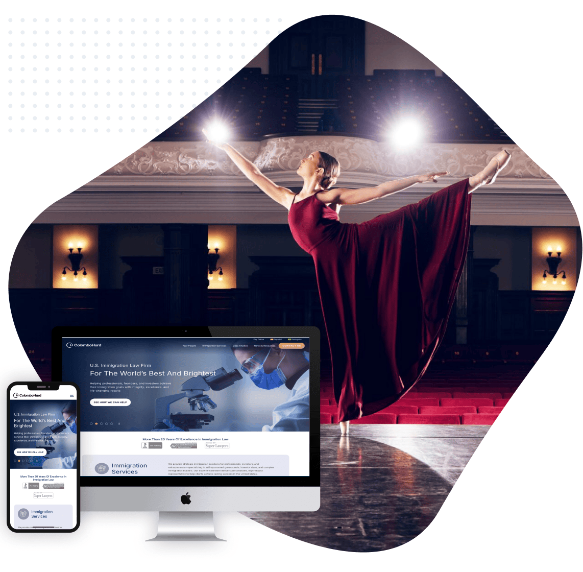
- Mobile Please: Mobile users increase every year, so having a website that is both touch-friendly and mouse-friendly is more of a necessity than a trend. Mobile users have a major influence in considering minimal web design. This translates to faster loading times, interactivity, and simpler pages for those using mobile devices. According to Omniture, mobile-optimized experience produces an average of 75% higher rate of engagements per mobile visitor.
- Infographics: This use of visual representation of stats has seen a burst of explosion recently. This will continue to get more popular with the current global economy as businesses budgets are scrutinized for optimal efficiencies and growth or sustainability. Here are some great examples from some of the top infographics in 2010.
- Lighter color palette: Bright color palettes have been around in all aspects of design for many years, but not this year. We have seen more use of pastel colors in collateral, packaging and web design. Expect the trend to go forward into next year.
- Recycled: It is very trendy right now to promote sustainability, especially in Seattle, by using FSC certified paper and recycled materials for print collateral. Nike has taken this idea one step further, now including clips from their old commercials over the years to create this clip calling this NikeBetterWorld.
- Light texture: Print designers are going to be using paper with light texture to enhance the textile quality of their work. For all you webbies, web designers will see more light texture (aka make some noise!). Texture helps create depth to the flat dimension of an on-screen design. Take a look at some good examples here at Psd Tuts Plus’s website.
To close out, trends come and go, but as a designer it’s essential to study them so you stay relevant to the culture. Some things to consistently follow are color palates as this always influences design, and fashion. A good website is the Pantone website which has the top 10 colors for women’s fashion; click here to follow the site.
In a world where attention span is getting shorter by the year, you can bet that designing for a market that values the short term “grab” is going to be very important. Being keenly aware of these trends helps us make important choices. Even more, it can help us spot a trend before it starts to develop.