Why are headers so important?
First impressions mean everything in the digital world, and your header provides the first impression of your website. Why should someone goose to spend time on your website? Give them a reason.
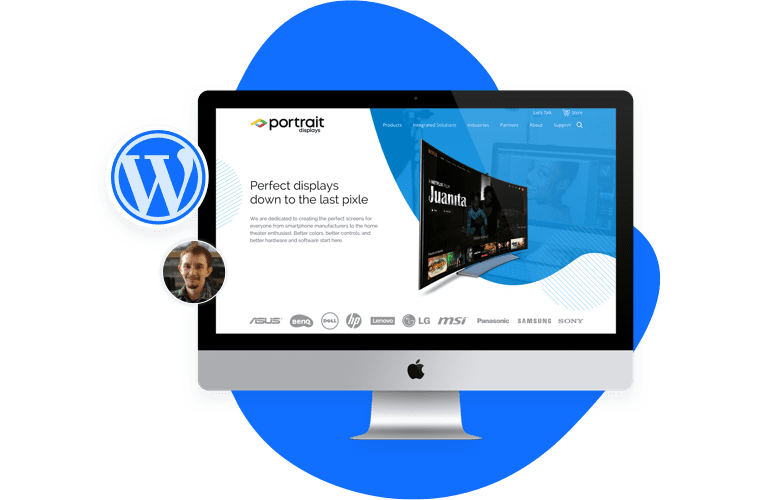
Your header should serve a purpose. It should reflect the theme and content of your website. Think of if in the way that you think about a book or a magazine cover. Without quality design and style, you wouldn’t give it a second look. The header is the cover of your website.
What makes a good header?
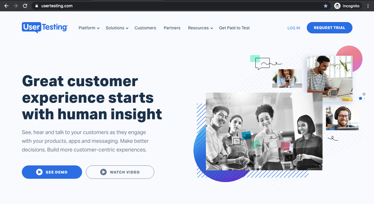
1. First, a logo placed in the left corner. Our eyes scan pages from left to right, which means your logo will be the first thing the user sees. You want people to remember your Brand.
2. Typically the logo is clickable – linking back to your home page. This is becoming standard for header design.
3. Make your contact information easy to locate. Usually an email address and/or phone number is placed on the opposite side of the header. This is also becoming standardized, especially with e-commerce websites. Have a strong “Call to Action” in the header as this will always be visible. You always want to direct your user to the conversion page, so having a button such as “schedule appointment” or “Free Consultation” allows you to direct them to the conversion page. People want options, they don’t always want to give you a call. Most times people want to buy or book directly online.
4. Not all headers need to have pictures. Sometimes less is more. Modern web design does not use imagery in the header space outside the logo.
5. The average header is less than 200 pixels high, but headers do range from slim to half a page. Remember – the reason people come on your site is for information. If you’re a business owner people visit your site specifically to see how you will solve their problem. You don’t want the header to be a barrier for that information, people may leave your site. With so many devices to view websites, thinking about mobile and how your header will look. You don’t want a user to scroll and dig for information!
Some final things to think about while making your design: sometimes less is more. Cluttered headers are distracting. Your header should invite visitors in. Think overall Branding of your site and how its tied into your header. Most importantly – have a purpose to the design, whether you use an image, text or both.
Need help with a Website?
Our professional web design company are here to help and offer free consultation. Give us a call at 206.659.8955 or click on the button below to schedule.


