
Background
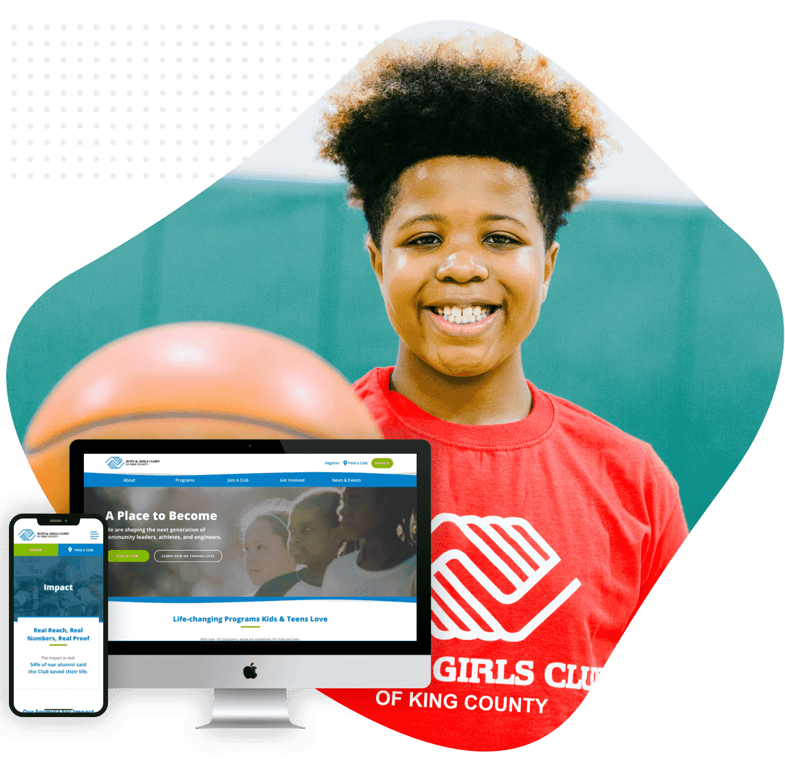
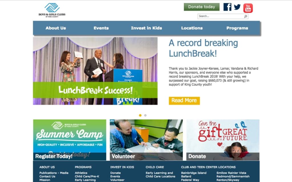
Boys & Girls Clubs of King County (B&G) is basically an after-school program superstar. From sports and arts to STEM and leadership, it empowers kids of all ages to gain experience and friends in any activity. Their problem was that they’re made up of 29 local clubs, and had no central control over their story, the quality of individual websites, or an intuitive user experience. The inconsistent online presence made the clubs seem less like a brand, and more like a random collection of rec centers. That’s where the boys and girls of Sayenko Design come in.
Project Included
Website Goals
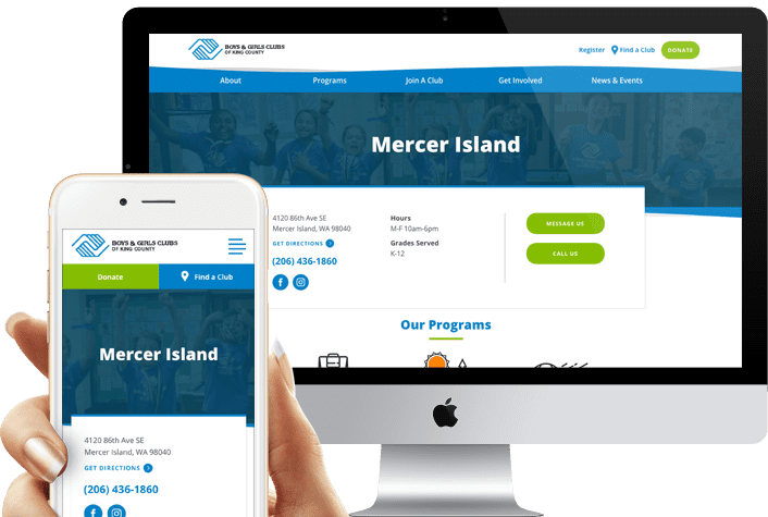
1) Strengthen the brand’s online presence by unifying all 29 individual clubs and programs into one website.
2) Build brand awareness by clearly sharing the mission, programs, success stories, and impact of the organization.
3) Transform the site into a communications hub to share information with parents, donors, and other stakeholders.
4) Promote an overarching call to action for donations, volunteers, and advocacy.
5) Increase revenue through online donations, club memberships, and licensed programs and sports.
Website Strategy
We began by reviewing the needs of B&G’s audience, which includes the parents of younger children, self-directed teens, and donors of all sorts. This meant that not only did the site have to be informative and reassuring for the many concerns of parents, but it also had to be modern and at least somewhat “with-it” to entice older members to continue coming. We researched B&G’s competitors to find the perfect mix of message, voice, and content, helping it stand out and convey its offering to all audiences. We made sure to implement best practices for design and site structure to improve SEO and user navigation. With this, visitors of all ages could find exactly what they’re looking for in a frictionless, simple experience.
Consistent Organization-Wide Ux
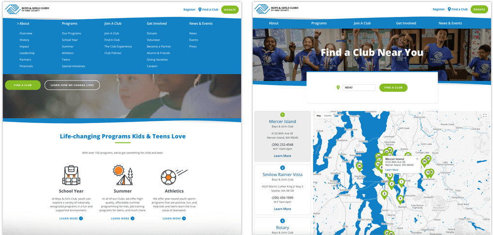
We restructured the entire user experience while consolidating all local clubs’ information and programs. Below are a few of the many upgrades:
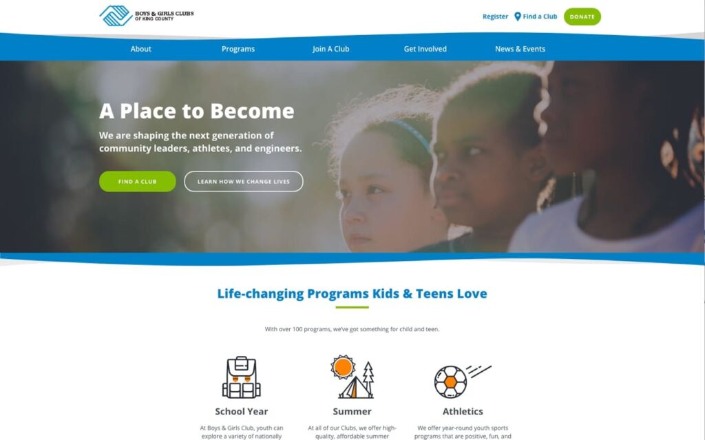
1) A single mega menu that expands across the width of the screen, with a fixed top-level navigation bar.
2) The menu was simplified into five key areas: About, Programs, Join a Club, Get Involved, News & Events.
3) A Find a Club section at the top which helps visitors easily drill down by zip code, their local club experience displaying within the main site.
4) New, consistent infographic elements, calls to action, and photography across the entire site.
The Results
156%
Increase in Page Views
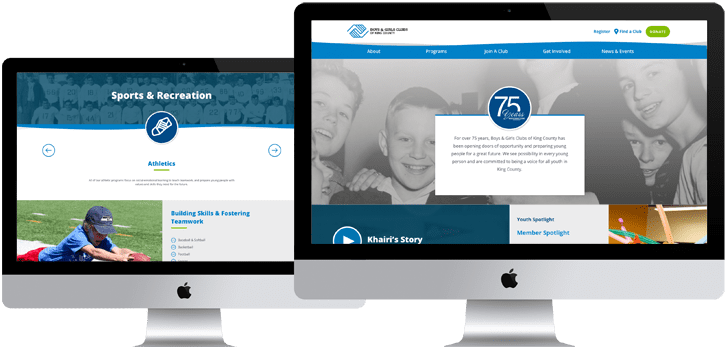
Now for our favorite activity. We helped parents, students, and donors alike build emotional connections, find information quickly, and participate in B&G’s activities and success. The results speak for themselves: increased time spent on site, increased number of pages read and enhanced conversions from the new call to action. B&G is now ready to help the next generation grow into better citizens, athletes, creators, and leaders. How’s that for an after-school special?

A Word from the Client

“We’ve seen a huge improvement. We have integrations with search engines and with digital marketing, as well as the ability to build landing pages for content and various campaigns throughout the year. I can foresee all the benefits that the site will bring. It’s a lot easier to manage and I’m sure it will increase and drive our revenue in 2019.”
~ Chris Brown, Marketing & Communications Director
Typical Project Includes
We’d be happy to take you through our discovery process, present our recommended solution, take you through our processes, introduce our team and show you some in-depth client reviews. According to Clutch, we’ve been selected #2 web design Seattle firm.
See our Processes on web design, website strategy, and web development.


