A Comprehensive Guide to B2B Website Design (plus 6 best website examples)
A Comprehensive Guide to B2B Website Design (plus 6 best website examples)
Building an effective B2B website is a powerful tool in ensuring your business connects with potential customers and understanding the specific needs of this industry plays a crucial role in your online success. Unlike B2C websites, which focus on attracting individual consumers, B2B websites must convey complex information in a way that is clear, professional, and tailored to the needs of other businesses.
This article explores the key principles of B2B website design, offering actionable tips to create a platform that not only attracts website visitors but also converts them into long-term business partners.
What is a B2B Website?
A B2B (Business-to-Business) website is a digital platform that facilitates the interaction between businesses. Unlike B2C (Business-to-Consumer) websites, which focus on engaging individual consumers, B2B websites serve companies and other organizations. These websites are designed to showcase products or services that provide innovative solutions to help businesses improve efficiency, reduce costs, or increase profits.
B2B websites often need to communicate more technical and data-driven information, offering solutions that cater to an organization’s specific needs. The B2B sales cycle is generally longer and the customer buying decision often involves multiple key stakeholders so B2B websites must prioritize building trust and credibility, ensuring companies are confident in their purchasing decisions.
B2B vs B2C Web Design
While both B2B and B2C websites share a common goal of driving conversions, their designs significantly differ based on their paying customers. Understanding the key differences between these two types of web design can guide you toward making more informed design decisions.
Audience Complexity
B2B audiences typically consist of multiple decision makers, each requiring specific information relating to their particular needs and priorities. In contrast, B2C websites target individual consumers with emotional and quick purchasing triggers.
Sales Cycle
B2B sales cycles tend to be longer and more complex than B2C. The decision making process often involves several stages, from research and comparison to negotiations and contracts. As a result, B2B websites must provide detailed information, case studies, and resources that foster long-term user engagement.
Content Marketing
B2C websites often focus on creating engaging, visually appealing content that highlights product benefits. B2B sites, on the other hand, emphasize technical specifications, value propositions, and detailed information about products and services.
User Experience
B2C websites are optimized for quick and seamless transactions, favoring the shorter sales cycle. In comparison a B2B website focuses on creating a user experience that supports the research and decision making process, with logical information flow and easy access to support or sales teams.
Tips for Effective B2B Web Design
Know Your Target Audience
Understanding your potential clients allows you to speak directly to their business goals, desired outcomes and the specific pain points they face. When you understand these key elements, you can identify the challenges faced by your ideal customers and present your business as the solution to these problems. Knowing how to address these needs is the foundation of your website strategy, allowing you to attract the right visitors and drive them towards engaging your services.
Create Visual Appeal
First impressions matter. A visually appealing website conveys professionalism and authority and should immediately start to build trust and confidence in the products or services offered. The website’s overall design should be clean, clear and easy to navigate. An uncluttered layout and effective use of white space ensures that your key information is prominently displayed and promotes smoother customer interactions and increased lead generation.
Highlight Your Unique Value Proposition
A strong unique value proposition (UVP) distinguishes your business from competitors. Your UVP should be front and center on your homepage, clearly communicating why potential clients should choose you over other solutions. When crafting your UVP you should use concise and impactful language that focuses on how your solutions can save time, reduce costs or provide other tangible, business driven benefits.
Prioritize User Friendly Design
A well designed B2B website should be intuitive and efficient to use. Business buyers need quick access to key information in the initial research stage and a clear path through the more detailed technical content as they progress. A user friendly interface enhances the customer experience and removes any potential barriers to conversions.
Build Brand Recognition
Strong and consistent use of branding across your website strengthens your business’s reputation and builds your credibility. B2B customers are often comparing multiple products or services online, so a clear and recognizable brand identity can help you stand out against your competitors and ensure that your business is remembered. Use your brand colors, fonts and logos consistently, maintain a cohesive tone of voice in your copy and use imagery that reflects your industry and your business personality.
Optimize for SEO
A great B2B website design is only useful if your target audience can find it. Observing best SEO practices throughout your website ensures that all elements are directly supporting your digital marketing efforts. SEO encompasses everything from keyword driven content and on-page optimization to site speed and usability on mobile devices so careful consideration is essential at all stages of the design process.
Essential B2B Website Design Elements
Calls To Action (CTAs)
Lead generation is at the heart of any B2B website. In order to generate leads, your website needs to be able to efficiently direct users towards taking a desired action. Your main CTA should be included in the header and footer of your site, incorporated into your homepage design and be present and consistent throughout the website so users are guided at every step.
Intuitive Navigation
Due to the complexity and detail required, B2B websites have a large volume of content that needs to be accommodated. A seamless navigation experience provides a straightforward path, helping users instantly identify and locate what they are looking for. Include a clean navigation bar with clearly labelled menu items and distinct categories or site sections. Utilizing breadcrumbs assists users in knowing where they are and in jumping back and forth between key pages and a search function will help users find specific information.
Pricing Plan Page
When comparing professional solutions, pricing is a defining factor for most businesses. While some B2B companies prefer to have users get in contact for pricing information so they can address each lead personally, displaying a range of pricing or package options can increase transparency and encourage inquiries. Use a simple pricing table to summarize each product or service tier and highlight your recommended package to draw attention. Clearly communicate what’s included in each pricing plan and the benefits customers can expect and include a CTA button for each option, directing the user to the next step.
Custom Graphics
Custom graphics can help clarify complex information, especially in industries that rely on technical data or specifications. They can also support a cohesive brand identity and be used to break up content or draw attention to specific areas of the design. Incorporate infographics, diagrams and charts that clearly illustrate key information, explain processes and break down the features of your products and services.
Social Proof
B2B buyers need to feel confident that they’re making the right choice, and social proof can help build this trust. Social proof demonstrates real world success stories, illustrates measurable outcomes and establishes credibility. Include testimonials, case studies, logos of companies that have used your services and reviews from previous clients.
The Best B2B Website Examples
These websites provide clear examples of the above practices in action. Use these as inspiration or a starting point for your own B2B website.


MicroVision
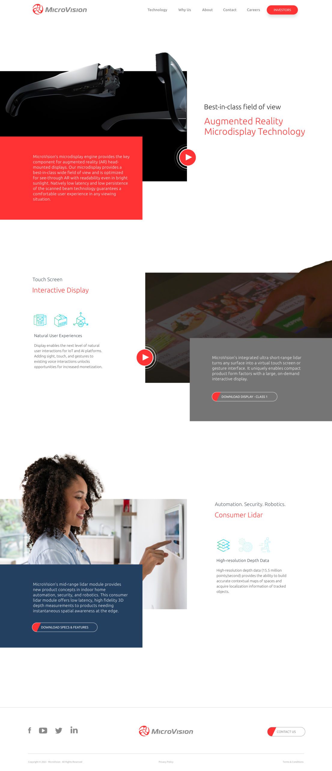
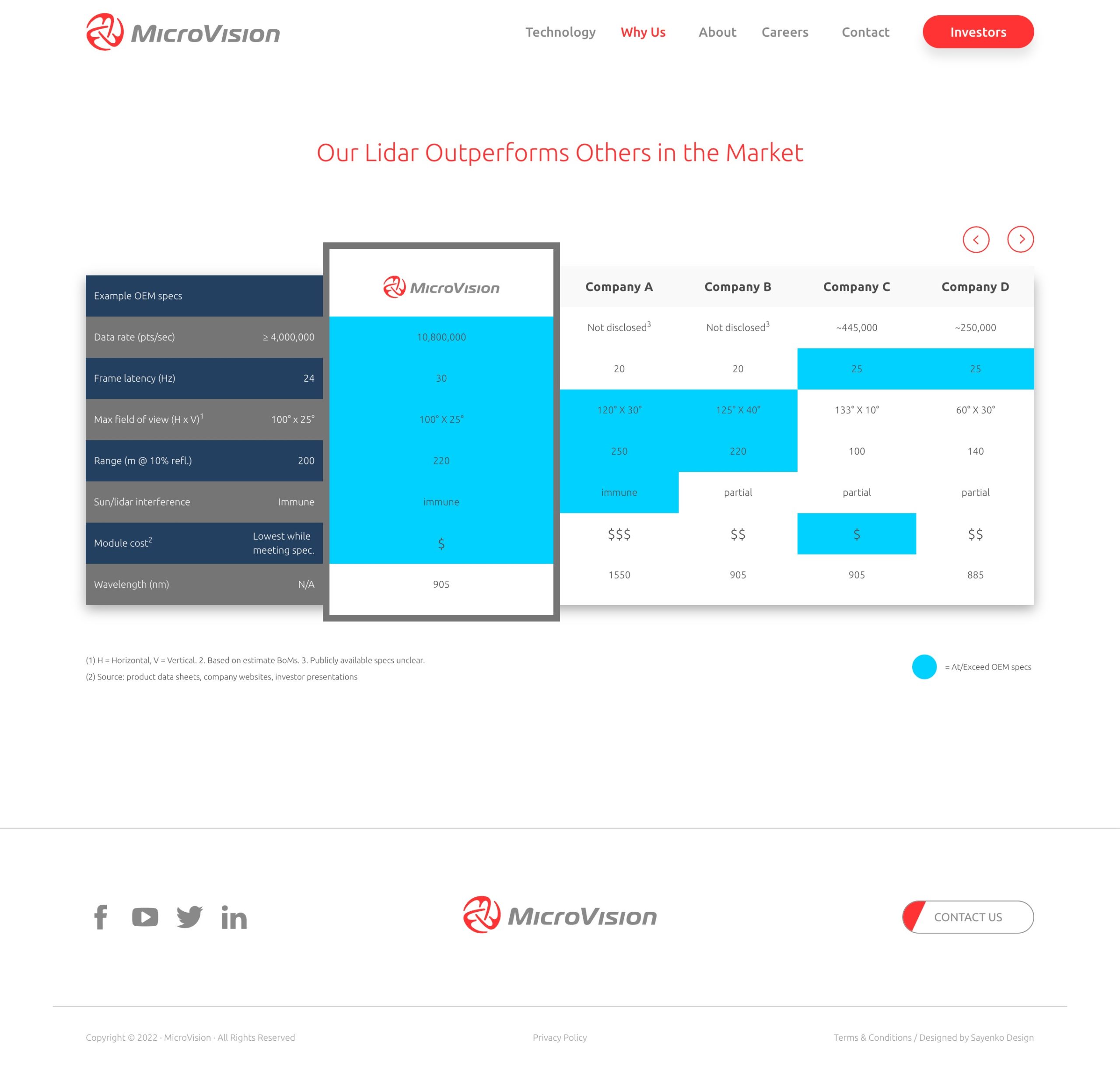
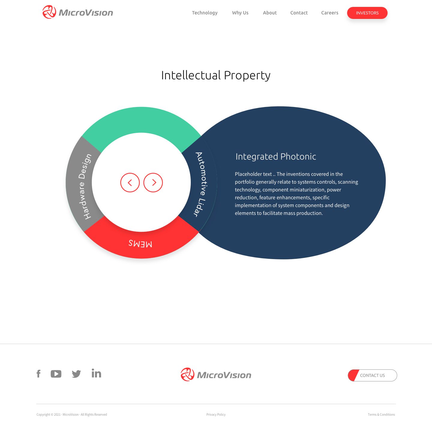
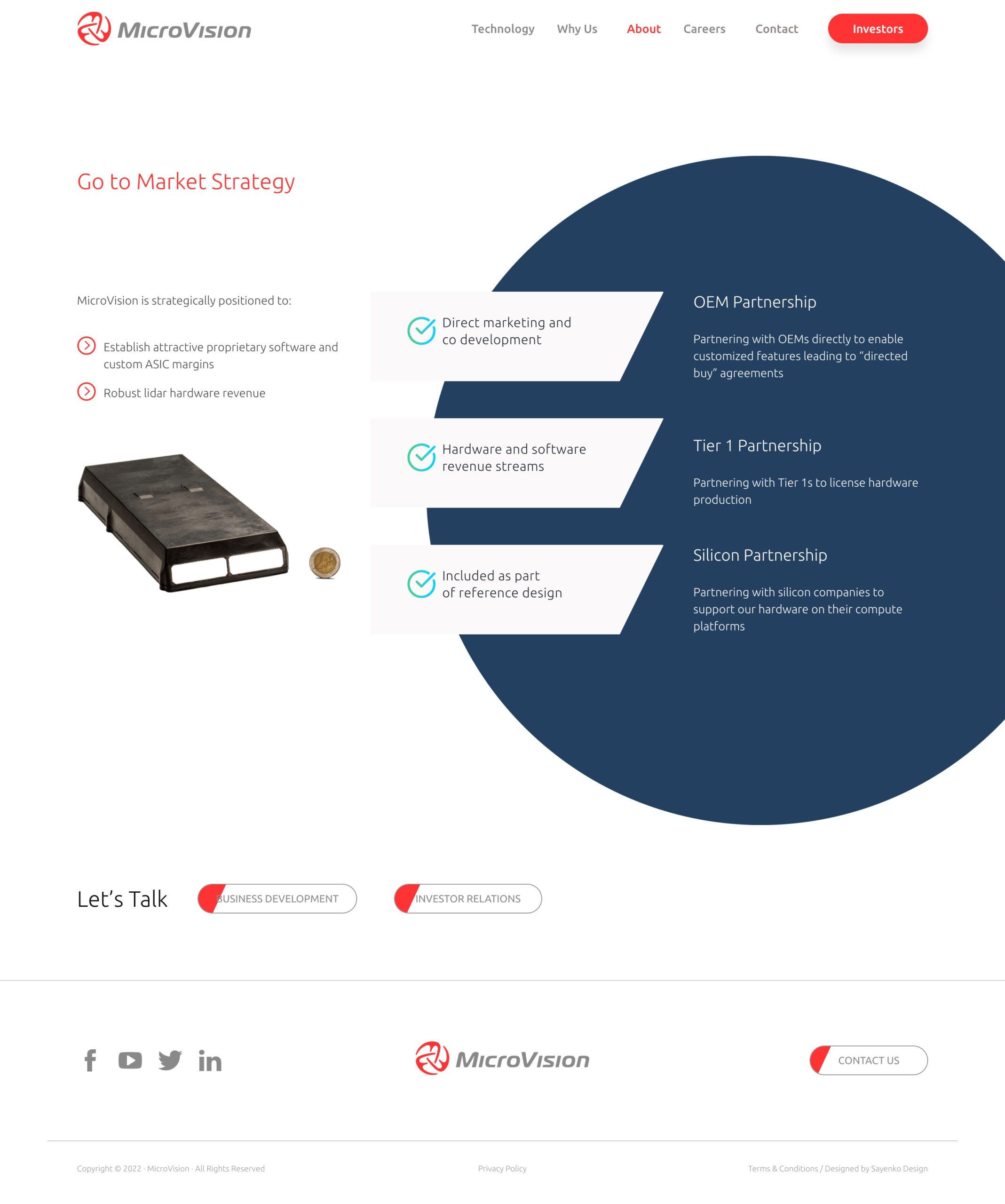
The MicroVision site features a clean and minimalist design that leverages a professional layout with ample use of negative space to keep the focus on its cutting-edge products and solutions. Product pages provide detailed information alongside custom graphics and diagrams, making complex technical data easy to understand. Tables are used to show clear comparisons of the product specifications against the competition and logos of prominent brands that have utilized their technologies offer social proof. The site also offers a multilingual interface supporting both English and German speaking audiences to target the key business locations in the USA and Hamburg.
Wider Circle
The Wider Circle website targets different audiences through the development of detailed user personas. Premium content then speaks directly to each user, selling the benefits of the services according to their particular needs. A hero video on the home page tells the story of the organization and helps to build a sense of connection and trust. The use of vibrant colors and strong typography align with the clear, mission-driven message of the brand. The site prominently features its unique value proposition – connecting neighbors for better health – through engaging visuals and concise messaging.

Portrait Displays
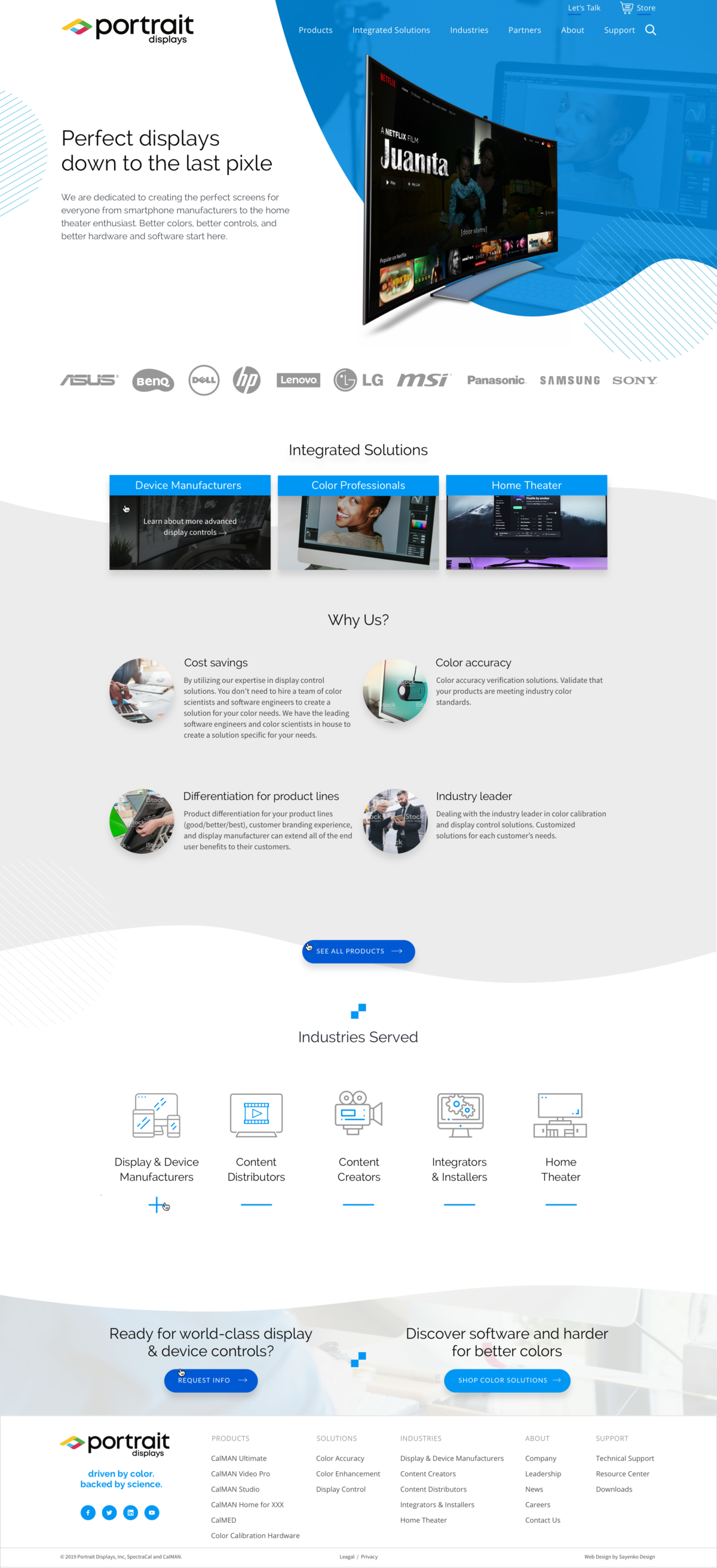
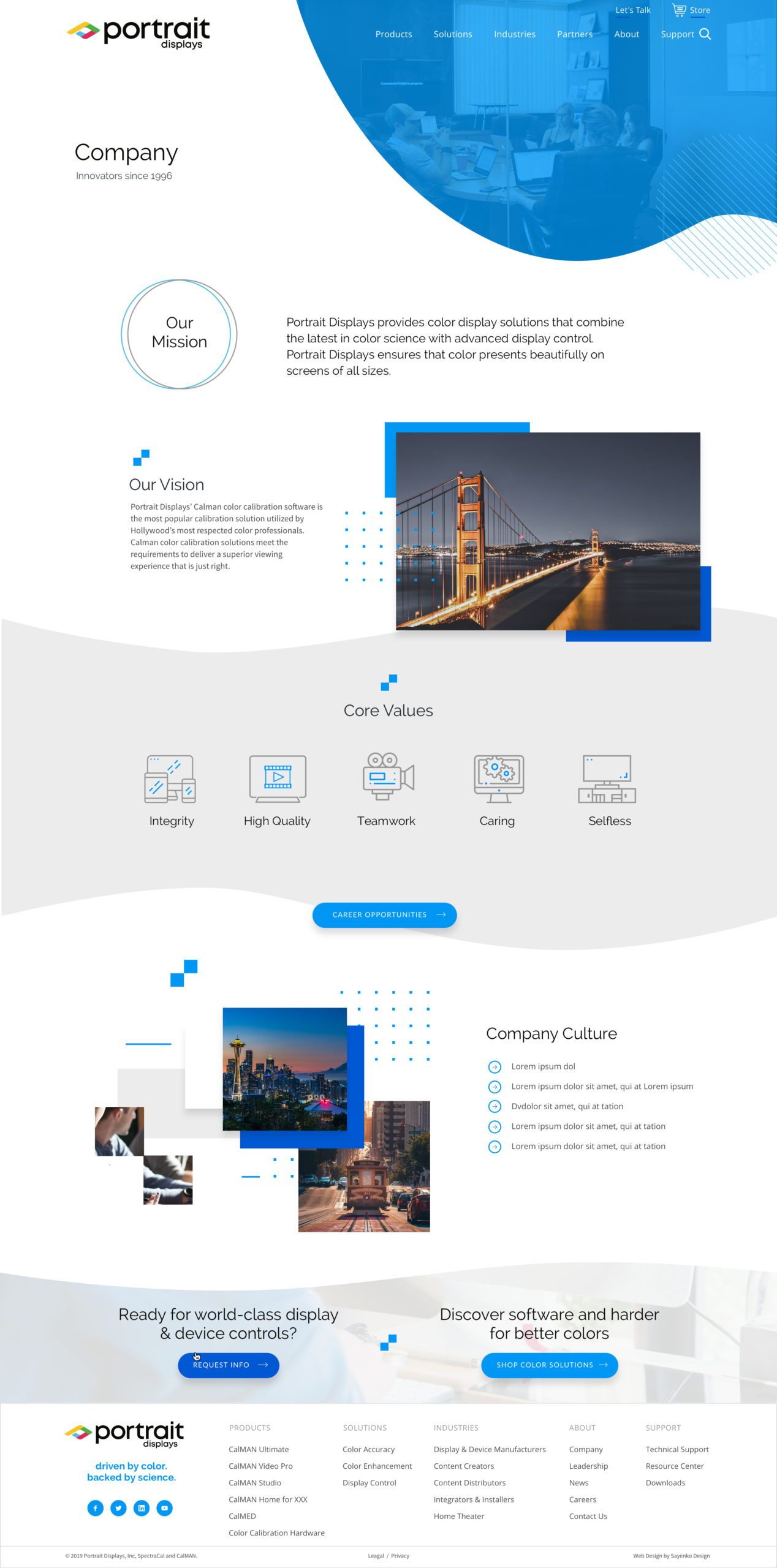
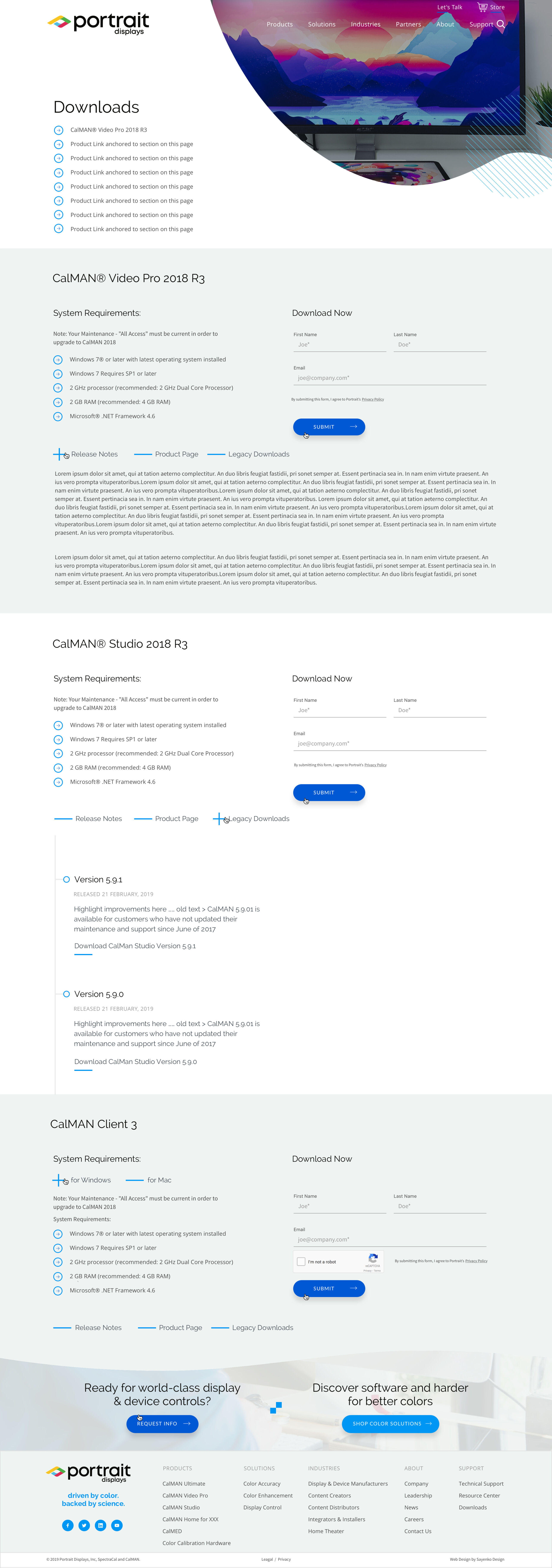
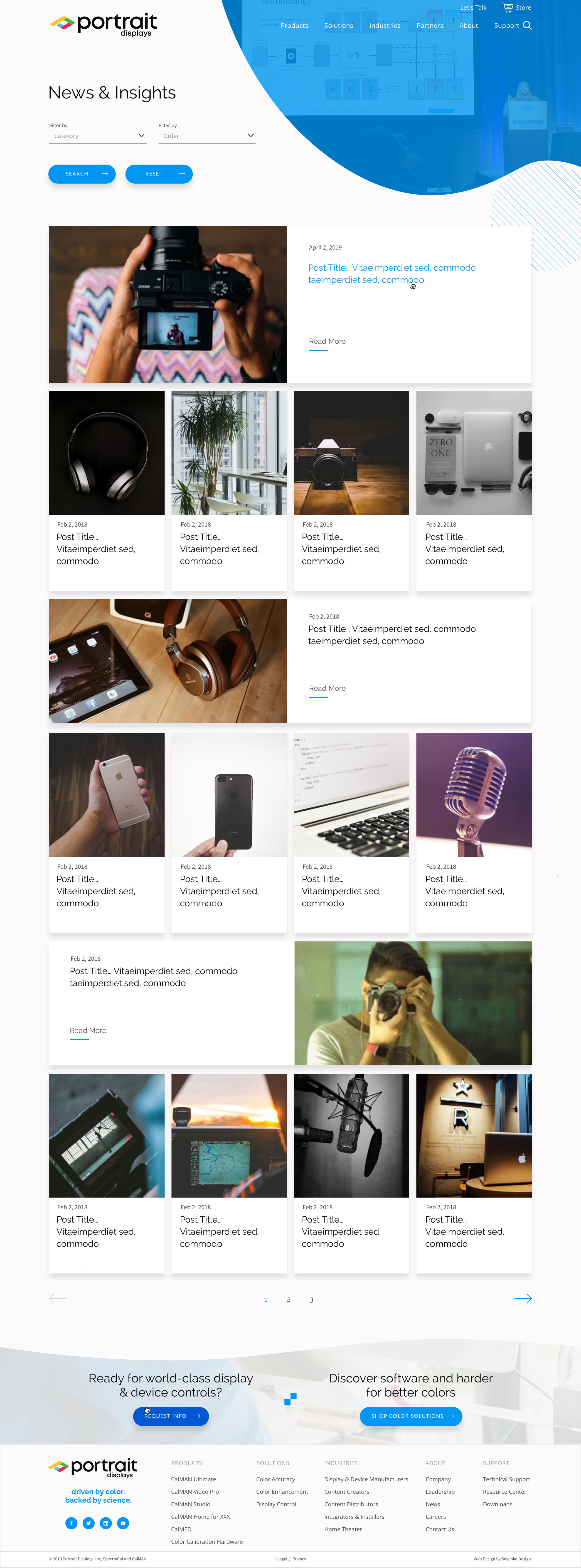
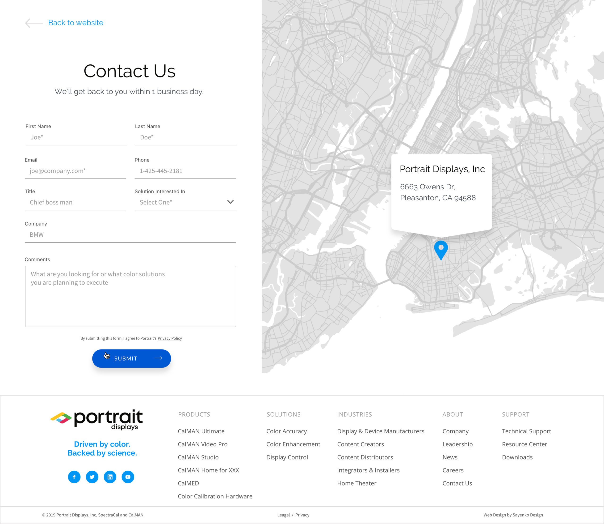
The Portrait Displays website is another great example of a modern design and clean layout with effective use of white space. The home page is broken into clear sections, covering product categories, user groups and key business information concisely with strong and effective use of CTA blocks throughout all pages. Product pages clearly summarize product benefits, integrated with CTA buttons and a contact form for effective lead generation.


Erickson Inc.
Erickson’s new website has been cleverly designed to support a large volume of information in a clear and easily to navigate format. Emphasis has been placed on intuitive navigation and subtle use of custom icons to identify different sections. All sections of the site are cross linked to support in depth research and exploration. User friendly design and modern UX practices help to streamline the lead process and guide users into the sales funnel. The site makes good use of clear and effective case studies, press releases and news articles to build authority and trust.
Defined Crowd
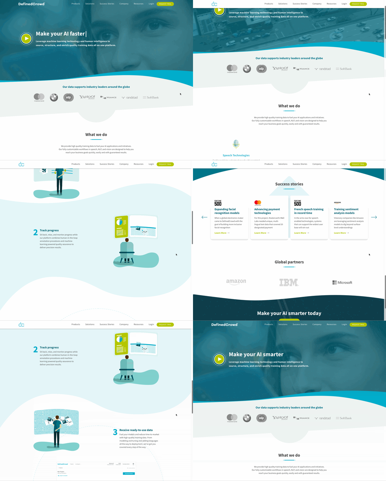
AI (artificial intelligence) is a rapidly growing industry, so the Defined Crowd website had to grab attention fast. The unique value proposition is designed to stand out on the home page, supported by animated graphics, success stories and high-profile customer logos. Intuitive navigation ensures businesses can quickly find relevant solutions and case studies that demonstrate real world applications. The site focuses on lead nurturing through a comprehensive resource section, integrated with Salesforce for marketing automation and shopping cart like functionality that leads users down the sales funnel.


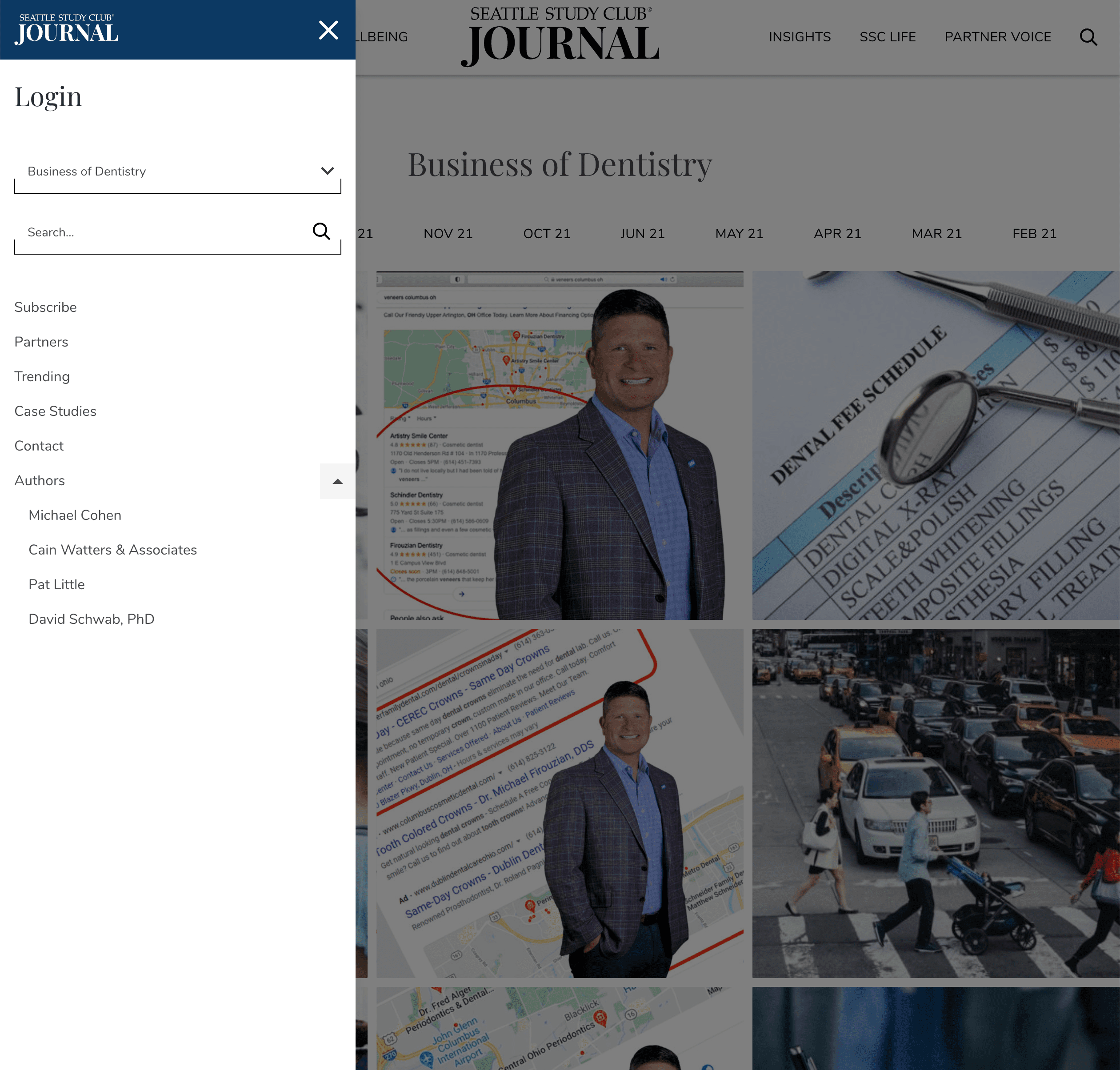
Seattle Study Club
The Seattle Study Club excels as a B2B website by combining professional aesthetics with user friendly functionality. Tailored to the medical and dental community, the site presents a clean, structured layout that highlights educational opportunities, events, and resources. Clear navigation allows potential partners and members to easily access relevant information, while the custom graphics and clear messaging enhance engagement. Through inclusion of case studies, the website effectively builds trust and authority within the healthcare industry, making it a strong tool for networking and collaboration.


