The home page is your company’s face to the world. It doesn’t make a difference if it’s your business or a personal website. It’s the first impression to your visitors, why not make it a good one? More so then ever potential clients will look at your company’s website before doing business with you.
The homepage is the most important page on your website. Why? Because it gets more views than any other page on your website.
The home page design seems simple, but it’s important to maintain certain web standards. The following are nine web design standards you can follow to increase the professional impression of your website.
Things to keep in mind:
1. Make the site’s purpose clear
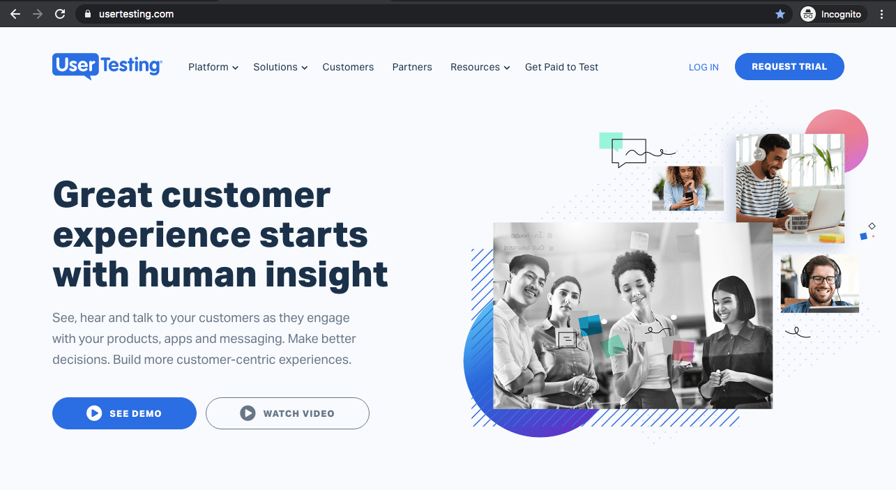
A user should understand within 3-5 seconds what you do. Use keywords so users will find your website on search engines such as google. What key words would potential visitors type in google or yahoo to find you?
2. Include a short one-sentence Tagline.
This is usually in the header next to the logo. Generally, the logo is found in the upper left, as people read left to right. This way, people will see the logo first. To the right of the logo should be the tagline. To find out more, check out the article entitled, “Creating a Good Header”.
3. Who, What, Why and a Call to Action
Build a brand narrative on your homepage, answer users main questions – who are you? what do you do? why you? and what should I do next?
4. Pick One or two Priority Points on your site.
For example on Sayenko Design, our two are the ‘image gallery’ and the ‘featured article’. The priority point(s) will take up most of the home page.
5. Use Strategic Graphics.
Don’t just decorate your website with meaningless stock art. Imagery is a very powerful communicator when used properly. We use a gallery portfolio on our website of our most recent work that we are proud of. This is used to connect potential clients to our brand and style.
6. Make Sure Navigation is visible and clear.
You should always have the Home page be the first tab so people can navigate back to it. The most important tabs should be first. Usually it’s an “about” page, which displays the services provided, products, blog, and contact info. Also, you want to be clear on the name of the tabs.
7. Don’t Clutter.
Keep the home page clean. Often we see homepages with way too much going on. This may choke the important links and information that people are looking for. Keep it to 3-5 sections/ content blocks.
8. Have Easy Access to Recent Homepage Features.
A recent article (blog) featured on your home page is a great way to connect your visitors with fresh information. Sayenko Design has the five most recent articles on our home page. Writing articles also adds to the key words on your website and therefore ranks your site higher on search engines based on your rich key word content.
9. Connect Through Social Media with Visitors.
Social Media is a very powerful free tool to market your website – facabook like button is very good way to connect your visitors to your content. It allows you to see what people are interested in, which is very important tool you can use to improve your website. Having a facebook and twitter accounts that link from the home page is standard these days. If you want repeat visitors, which should be the goal of every website, I highly recommend using both twitter and facebook.
10. Different pages for different industries
We focus on web design for key industries such as education, startups, consulting, construction, nonprofits, real estate, healthcare, and technology sites. Our team is dedicated to creating visually engaging, custom websites tailored to meet each industry’s specific needs. With an emphasis on functionality and user experience, we help businesses and organizations establish a strong online presence and drive meaningful growth.
Related Articles:


