In the mesmerizing world of web design, colors hold the power to evoke emotions, shape perceptions, and create memorable experiences for users. Harnessing the full potential of color can be a game-changer, transforming an ordinary website into a captivating digital masterpiece.
The effective use of color in web design goes beyond aesthetics; it plays a vital role in guiding users, highlighting essential elements, and establishing a strong brand identity. So to infuse color psychology into your digital strategy, we’ve put together a few quick tips to help you get started.
The Psychology of Colors: A World of Emotions
Colors have a profound impact on our emotions and behaviors. Understanding the psychology of colors is fundamental to using them effectively in web design.
Warm colors like red and orange evoke feelings of passion and energy, making them ideal for calls-to-action and attention-grabbing elements.
On the other hand, cool colors such as blue and green evoke a sense of calmness and trust, making them suitable for portraying reliability and professionalism.
Choosing the Right Color Scheme
The success of a website’s color scheme lies in finding the perfect balance of colors that complement each other harmoniously.
Monochromatic color schemes use variations of a single color, creating a clean and sophisticated look. Analogous color schemes utilize colors adjacent to each other on the color wheel, creating a seamless transition between hues. Complementary color schemes employ colors from opposite ends of the color wheel, offering a striking contrast that captures attention.
Establishing Brand Identity through Color
Color is a powerful tool in establishing brand identity and recognition. Consistency in color usage across your website reinforces brand recognition and strengthens your brand’s message. By associating specific colors with your brand values, personality, and target audience, you create a lasting impression that resonates with visitors long after they leave your site.
Color Hierarchy for User Guidance
An effective color hierarchy guides users through your website, directing their attention to the most crucial elements. By assigning vibrant colors to primary calls-to-action and muted colors to secondary elements, users instinctively know where to focus their attention.
Color hierarchy creates visual harmony and simplifies the user experience, ensuring visitors can navigate through your website with ease.
Accessibility and Inclusivity Considerations
Inclusive web design takes accessibility into account, ensuring that all users, including those with visual impairments, can access and navigate your website comfortably.
Color contrast plays a vital role in accessibility. High contrast between background and text colors enhances readability for all users, particularly those with visual impairments. Color blindness is another consideration; using color alone to convey information might exclude color-blind users. Incorporate icons, patterns, or labels alongside colors to ensure inclusivity.
Evoking Emotion with Color Gradients
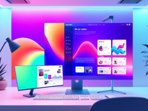
Color gradients, also known as color fades, have gained popularity in web design for their ability to evoke emotions and add depth to the visual experience. Gradients create a smooth transition between two or more colors, providing a sense of dimensionality to flat elements.
Carefully crafted gradients can evoke a sense of nostalgia, excitement, or sophistication, enhancing the overall aesthetics of your website.
The Art of White Space and Color
White space, or negative space, is the breathing room around elements on your website. It complements color and gives it room to shine. The strategic use of white space can enhance color impact, making your chosen hues stand out even more vibrantly.
White space also improves readability and visual clarity, creating a clean and modern design that engages users effortlessly.
A/B Testing for Color Optimization
A/B testing is a valuable technique to fine-tune the use of color on your website. By creating two versions of a page with different color schemes, you can test which one performs better in terms of user engagement and conversions. Through A/B testing, you can continually optimize color choices to align with your website’s goals and audience preferences.
Make an Impression With a Strong Color Palette
Colors are the magical brushes that paint your website’s canvas, eliciting emotions, guiding users, and elevating your brand identity. The effective use of color in web design goes beyond aesthetics; it creates an immersive and impactful user experience.
Understanding the psychology of colors, choosing the right color scheme, and establishing a strong brand identity are essential elements of masterful color usage. Consider accessibility and inclusivity, harness the power of color gradients, and artfully blend white space with colors to achieve a harmonious design..
As you wield the vibrant palette of colors with finesse, your website will become a vivid masterpiece that captivates visitors, fosters meaningful connections, and leaves a lasting impression on the digital canvas. And if you want to explore what the right palette for you is, don’t hesitate to get in touch with our experts at Sayenko Design.


