Don’t Make Me Think, How to Communicate Effectively on Your Business Website
Don’t Make Me Think, How to Communicate Effectively on Your Business Website


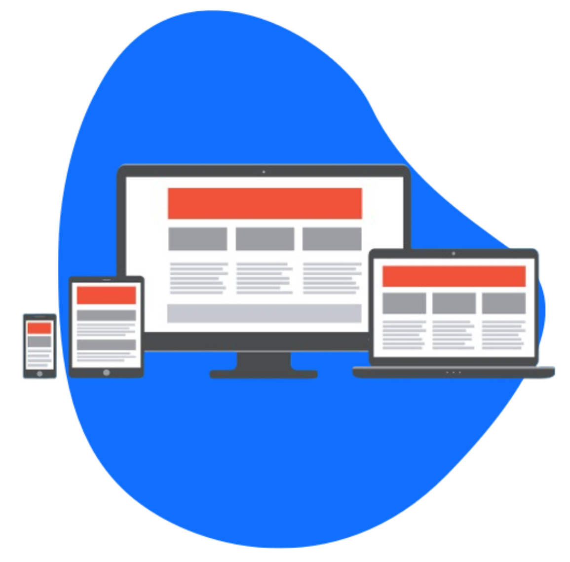
When it comes to web design, you want your website to be an effective communicator, correct? That means having your information clear and precise. The term “Don’t make me think” refers to your website structure and how easily and quickly your audience draws needed information from your site. This should be a simple process for your audience or they may get impatient and leave, or get the wrong impression about your site.
When most people create a website, they believe people are going to carefully read every page line by line, weighing their options before deciding which link to click. They imagine a user who is deeply engaged, absorbing all the content they’ve painstakingly put together.
In reality, most people glance at each page and, if you’re lucky, scan some of the text, clicking on the first link that catches their interest or vaguely resembles what they are looking for. Usually there are large chunks of the page that the user doesn’t even look at. They’re in a hurry, and your site is just one of many tabs open in their browser.
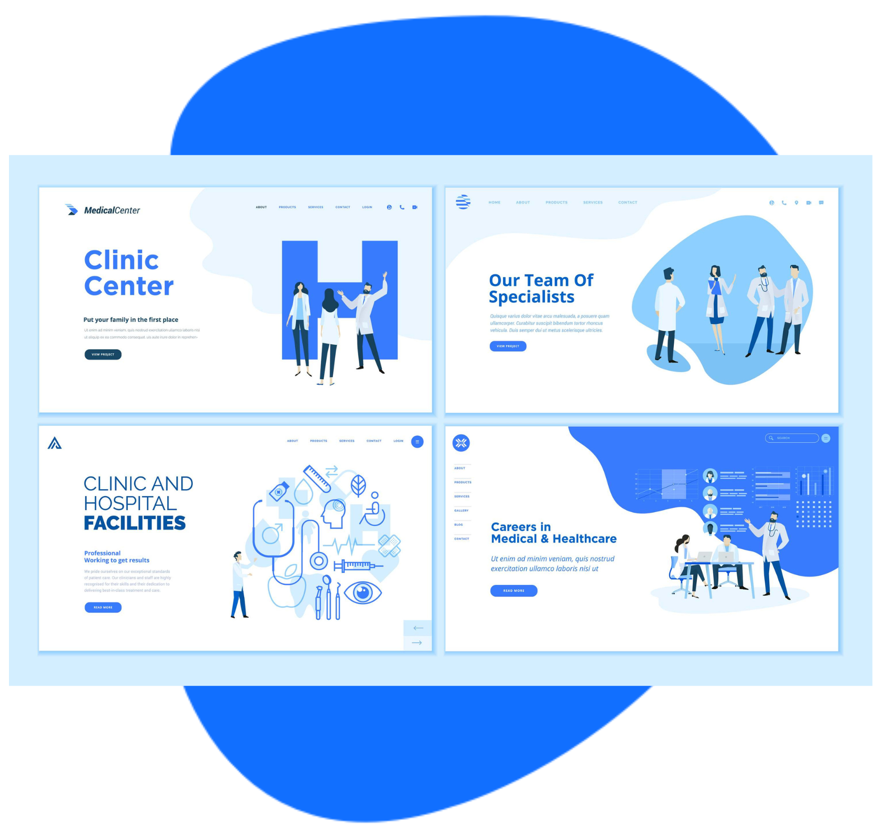
The Home page of a website gives a first impression and thus should have some thought invested in its design. It needs to be straightforward, easy to navigate, and possess a clear message. Think of it as the storefront window of a shop; it should entice visitors to come in and explore more. Below are some questions you need to ask yourself about your current website or the one you plan on building. If you cannot quickly answer the questions below then you might want to redesign your website.
Lets Start with the Trunk Test
- What site is this?
- What page am I on?
- Where am I in the site scheme?
- What are my options from this level?
Web Design
- Conventionally, the logo should be at the upper left hand corner because we read left to right and it is the first thing that catches our eye. Also, the logo should be easy to read, conveying useful information or enhancing the branding value of the website.
- The home page should have Call to Action and contact info placed prominently.
- Click-ability should be obvious
- Scan-ability – fast info
- Text entry areas are obvious – Empty space effectively ends the page and no one is going to scroll beyond it. Anything below this will be lost, so design page layout and flow to maximize sales potential of page real estate.
- Formatting applied via CSS (Cascade Style Sheets)
- Conventions applied to all pages
- Busy-ness and background noise are minimal
- Footer includes copyright date and text
- Correct Spelling/ Grammar
- Image Quality – make sure images are not pixilated (stretched out)
Navigation
- Intuitive, 1-2 clicks away
- Descriptive – don’t make me guess
- Avoid overly creative
- Avoid UX compromise for SEO
- Keep menu short -7 or less
- Prioritize most important far left as people read left to right, they’ll see it first
- Put visitors needs first before your wants
- Sense of scale, directions and location
- Page name matches that links that bring people there
- Breadcrumbs and site-level Navigation
When it comes to site design, most think of a product brochure, while the users reality is much closer to “billboard going by at 70 miles an hour.” People don’t read pages. They scan them. Try the three second scan-ability rule on your website, you have a very short window to grab their attention and communicate your message.
What can you remember about it after that time span?
The most important information should stand out from the rest in those three seconds and you should be able to recall what that information is.
Does this all make sense? If you use these easy usability conventions, your site will communicate clearly and effectively. Remember, the goal is to make your website as user-friendly as possible. You want to guide your visitors effortlessly through your content, leading them to take the desired action.
All professional web design agencies in Seattle utilize these techniques. They understand that good design is not just about aesthetics but also about functionality and user experience. By applying these principles, you can enhance your website’s effectiveness and provide a better experience for your audience.
So, take a moment to review your website. Put yourself in the shoes of a first-time visitor. Is your site easy to navigate? Is your message clear? Are your CTAs prominent? Making these adjustments can make a significant difference in how users perceive your site and, ultimately, in achieving your website’s goals.