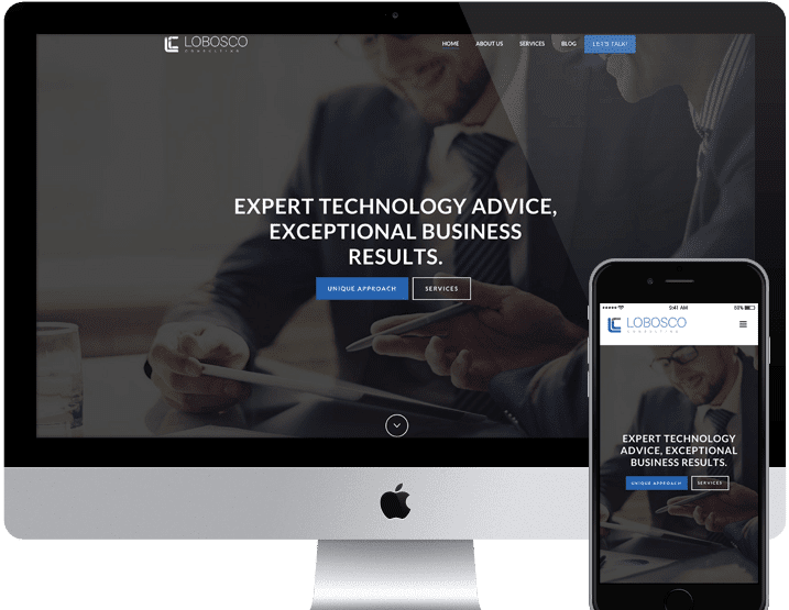
Position Your Consulting Brand
At Sayenko Design, we create intuitive B2B consulting websites by combining proven marketing strategies, SEO best practices, and powerful web design tactics. We always put mission-critical content first. The goal for any consulting firm’s site is to differentiate your brand, build trust with new clients, and highlight key case studies. All to do one thing—generate leads and close a deal.
Develop a Strategy with Personas
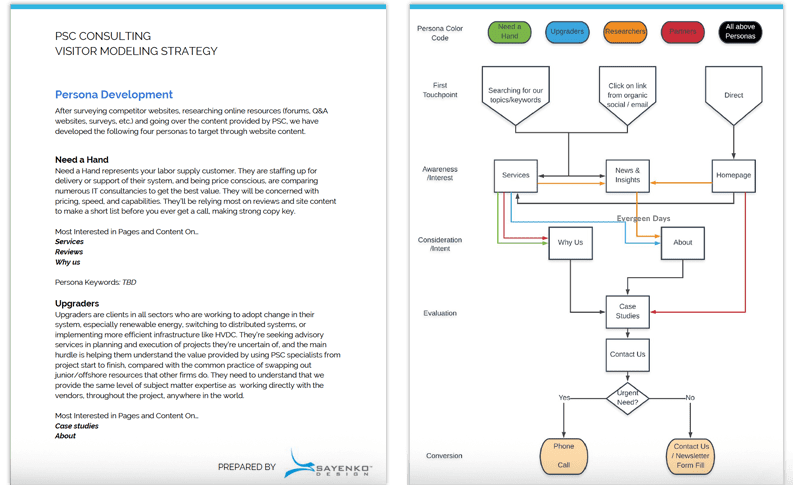
The first step to building a solid website for your consulting firm is to understand who’ll be using it. Whatever type of service you consult on, there will be a number of different types of clients and buyers who visit the site. By researching and building profiles on them, we can make sure you have content for each, and a clear path for them to follow until they fill in your lead form.
Build Authority with a Resource Center
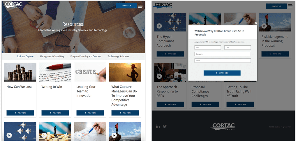
Anyone can claim to be a thought leader—prove it with great resources on your site. Resources are used throughout the top half of the marketing funnel, from awareness to consideration. Plan on giving 20% of your expertise away, in exchange for contact information to generate leads, and then begin a email marketing campaign. It’s a mistake to make your consulting website a static brochure. Instead, provide fresh content on a monthly basis, like white papers, webinar videos, blog posts, or infographics. How do you manage the time for this? We build you a site with an easy-to-use CMS so posting is as easy as possible, and integrate it with your CRM so leads come straight to you.
Answer Basic Questions to Build SEO
For anyone in the consulting business, search engine optimization (SEO) is mostly a matter of writing about the problems your clients face. Your resource center’s content strategy should aim to push out blog posts that answer highly-specific questions that potential clients search for, proving your expertise when they find your article and making you their go-to for solving similar problems. Answer enough little questions, and they’ll be coming to you for your services on the big questions.
Provide Proof with In-Depth Case Studies
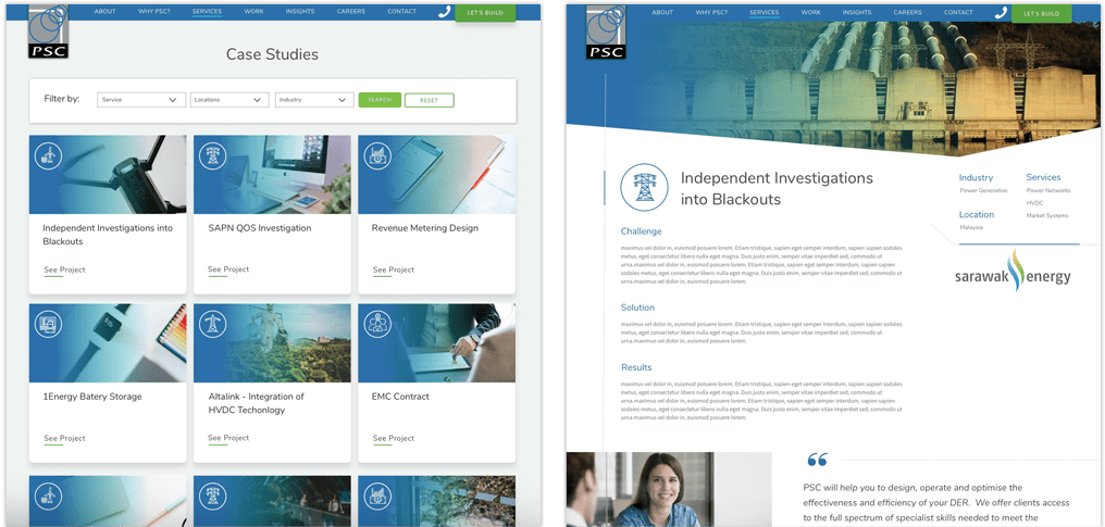
Case studies are at the intent and evaluation stage of the marketing funnel. The visitors who flow to these pages are getting ready to pull the trigger, and usually come from About and Service pages ready to see proof that you can walk the walk. Make sure to build a narrative, filled with challenge, innovation, and triumph. Put results in real, understandable terms, with numbers if possible and a testimonial to give that authentic stamp of approval. You could also add a “word from the team” at the bottom of the page, helping build up your team’s profile and linking to their bio pages.
Start Your Consultation with Chatbots
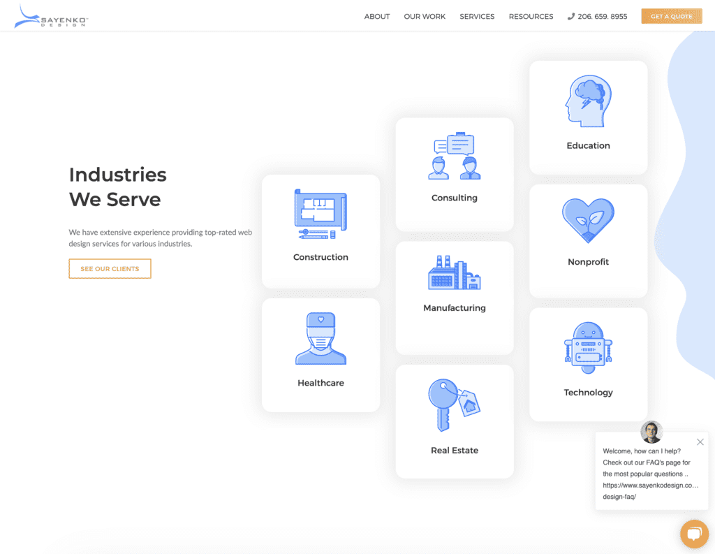
Since a lot of consulting is discussion, why not start off every interaction with site visitors that way? Implementing a chatbot in the lower right corner not only helps you stay on brand, it’s becoming a more common and expected aspect of most sites. You can put in the faces of various team members, and provide some automated answers to guide people through your consulting services site. And if they ask the right sorts of questions, you can escalate them to “live chat” and set a team member up to start talking with them directly through the bot.
Say Hello with Team Bios
Team bios are reviewed by visitors at the interest stage of the marketing funnel, because they are here to make a choice about whether to put trust in you personally. After all, people work with people they like, so you need to connect with them. Highlight your sales, leadership, and consultant teams at minimum, with professional and personal bios and consistent professional photography. Really build up your team’s profile by linking to resources they’ve personally published on the site, and a button to connect with them on LinkedIn.

Highlight Your Vision, Mission & Values
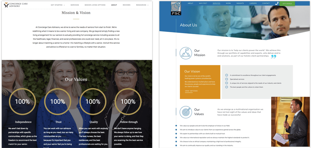
Present to potential clients a consulting website design that is consistent with the strategy, vision, and work of your business. Clients want to partner with a business that is a good fit philosophically, so put talk about it on the About page. As one of the most frequently-visited pages on your website, it’s often the first impression—so make it count!
