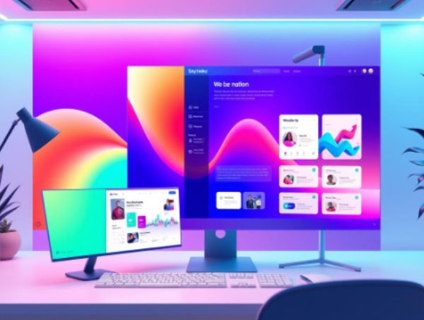
Website banners are often the first thing visitors see when they land on a website, and they play a critical role in setting the tone for the user experience.
Despite their importance, however, many people don’t know much about using them to add to the overall UX design of a website. To rectify this, we will unravel what website banners are and how to use them effectively to make your website stand out.
What are Website Banners?
A website banner is a visual element that appears at the top of a webpage, and its primary purpose is to grab visitors’ attention and provide them with important information about the website or its content.
Today, these banners come in different shapes and sizes, and they can be static or dynamic. They can be used for a variety of purposes, such as promoting a product, announcing a sale, providing information about the website or the business, or simply adding a visual element to the website.
Types of Website Banners
There are several types of website banners, and each serves a different purpose. Here are the most common types of website banners:
- Header Banners: These banners appear at the top of the website and are usually the first thing visitors see when they land on the website. They often contain the website’s logo, navigation menu, and other important information about the website.
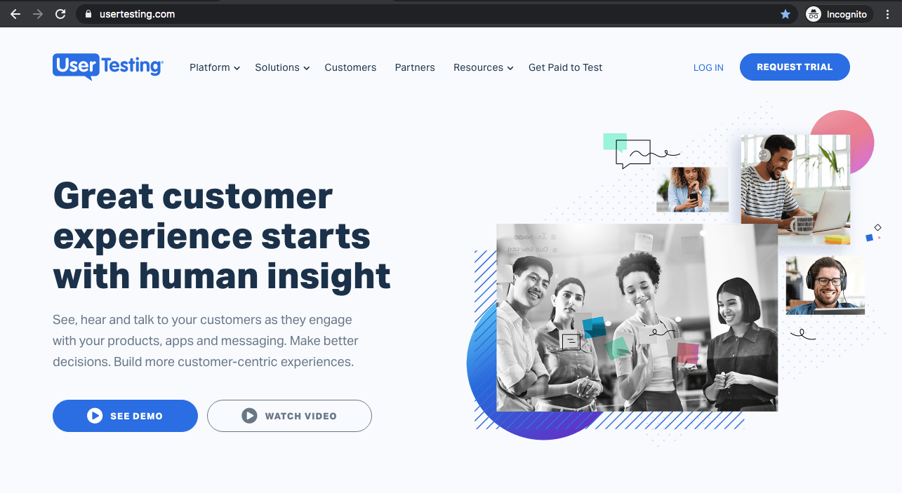
- Hero Banners: Hero banners are full-width banners that span the entire width of the screen. They are often used to showcase a product or service and can contain a call-to-action button that directs visitors to a specific page.
- Sidebar Banners: These banners appear on the side of the webpage and are often used for promoting products or services.
- Footer Banners: Footer banners appear at the bottom of the webpage and can contain important information such as copyright notices, contact information, and social media links.
How to Use Website Banners Effectively
Now that you know what website banners are and the types of banners available, let’s discuss how to use them effectively to make your website stand out.
- Keep it Simple: A banner should be simple and to the point. It should convey the message quickly and clearly. Avoid cluttering the banner with too much information or too many visuals.
- Use High-Quality Images: Use high-quality images that are relevant to the message you are trying to convey. Avoid using stock photos or low-quality images that can make your website look unprofessional.
- Use Contrasting Colors: Use colors that contrast with the background to make the banner stand out. However, avoid using too many colors that can make the banner look too busy.
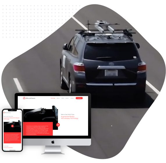
- Make it Responsive: Ensure that your website banner is responsive, meaning it should adjust to different screen sizes. This is important because visitors may access your website from different devices, such as a desktop computer, tablet, or smartphone.
- Include a Call-to-Action: A call-to-action (CTA) is a button that directs visitors to a specific page on your website. It can be used to promote a product, encourage visitors to sign up for a newsletter, or direct them to a specific page.
- Test and Monitor: Test different banner designs and monitor their effectiveness. Use analytics tools to track the number of clicks and conversions you receive from your banner. This will help you determine which banner designs work best for your website.
Make a Great First Impression With Unraveling Website Banners
Now more than ever, website banners play a crucial role in attracting and engaging users on your website. By incorporating the right design elements and messaging, they can effectively communicate your brand message and encourage users to take the desired action. Whether you want to promote a sale, announce a new product, or simply capture attention, banners can help you achieve your marketing goals.
By following the tips and best practices outlined in this guide, you can create effective website banners that help your business thrive. If you need professional help with your website design and development, consider reaching out to Sayenko Design to take your web design and custom wordpress development to the next level.


