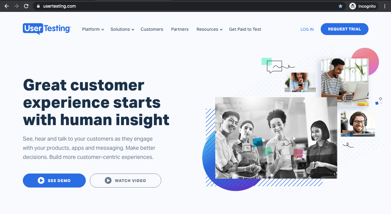
More and more people have been working from home since the pandemic started in 2020. The web has matured more rapidly—check out these 10 web design trends for 2022 that enhance storytelling, visual interest, and engagement. Web design is becoming an experience tailored to users’ needs, challenges, and motivations. Our article is packed with “when to use it” for each of the trends that you might find helpful with practical tips and examples.
Web trends are tied to telling a brand story through large format photography, micro animations, bold font choices, advanced interactions, and unique layouts that don’t feel cookie cutter.
As one of Seattle’s web design agencies we have listed Wed Design Trends years after years…
Read more about previous web design trends and UX principles:
- 2021 Web Design Trends
- 2020 Web Design Trends
- 2015 Web Design Trends
- 2013 Web Design Trends
- 22 User Experience Design Principles for Websites
Below are some inspiring web design trends for 2022 that are sure to make an impact measured by engagement (time spent on the website and conversions).
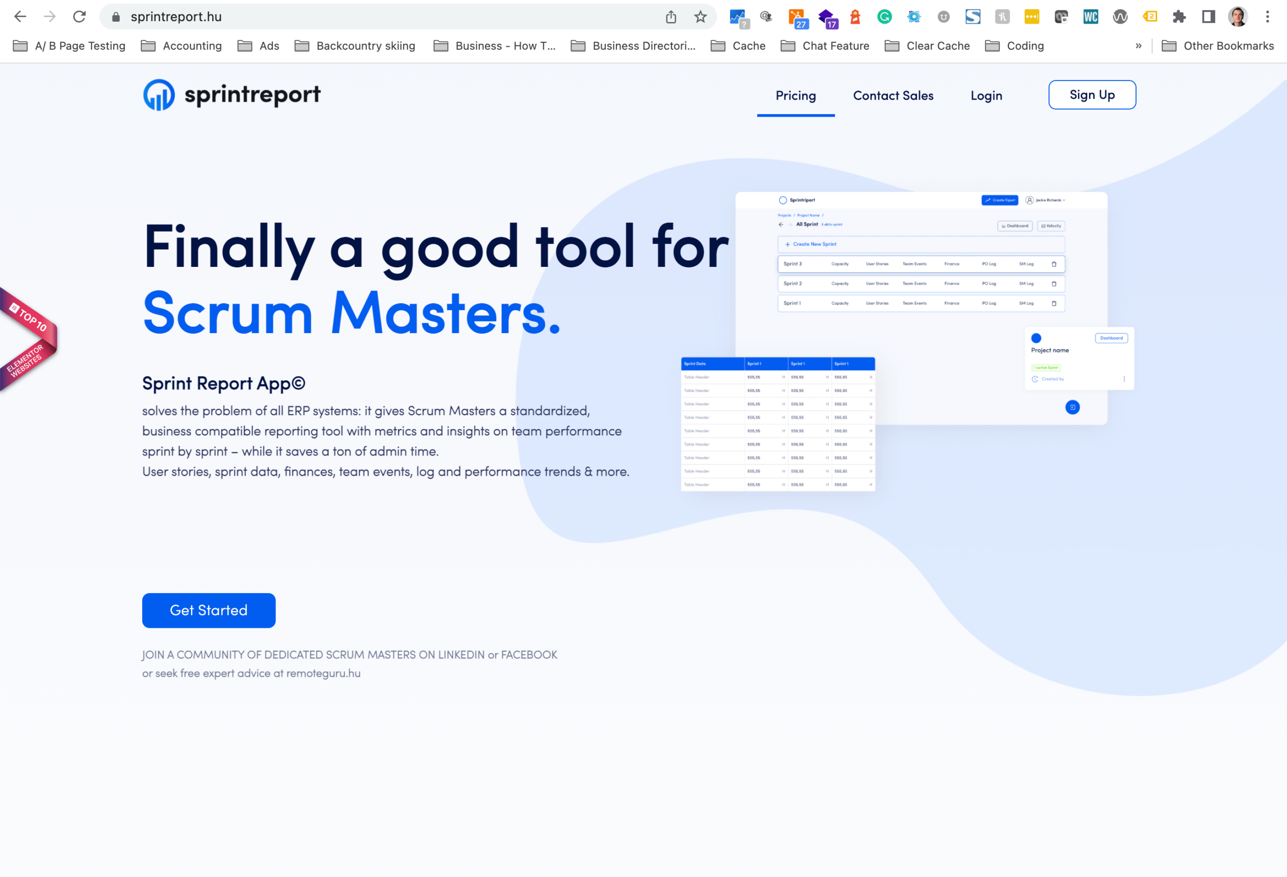
- One-page websites
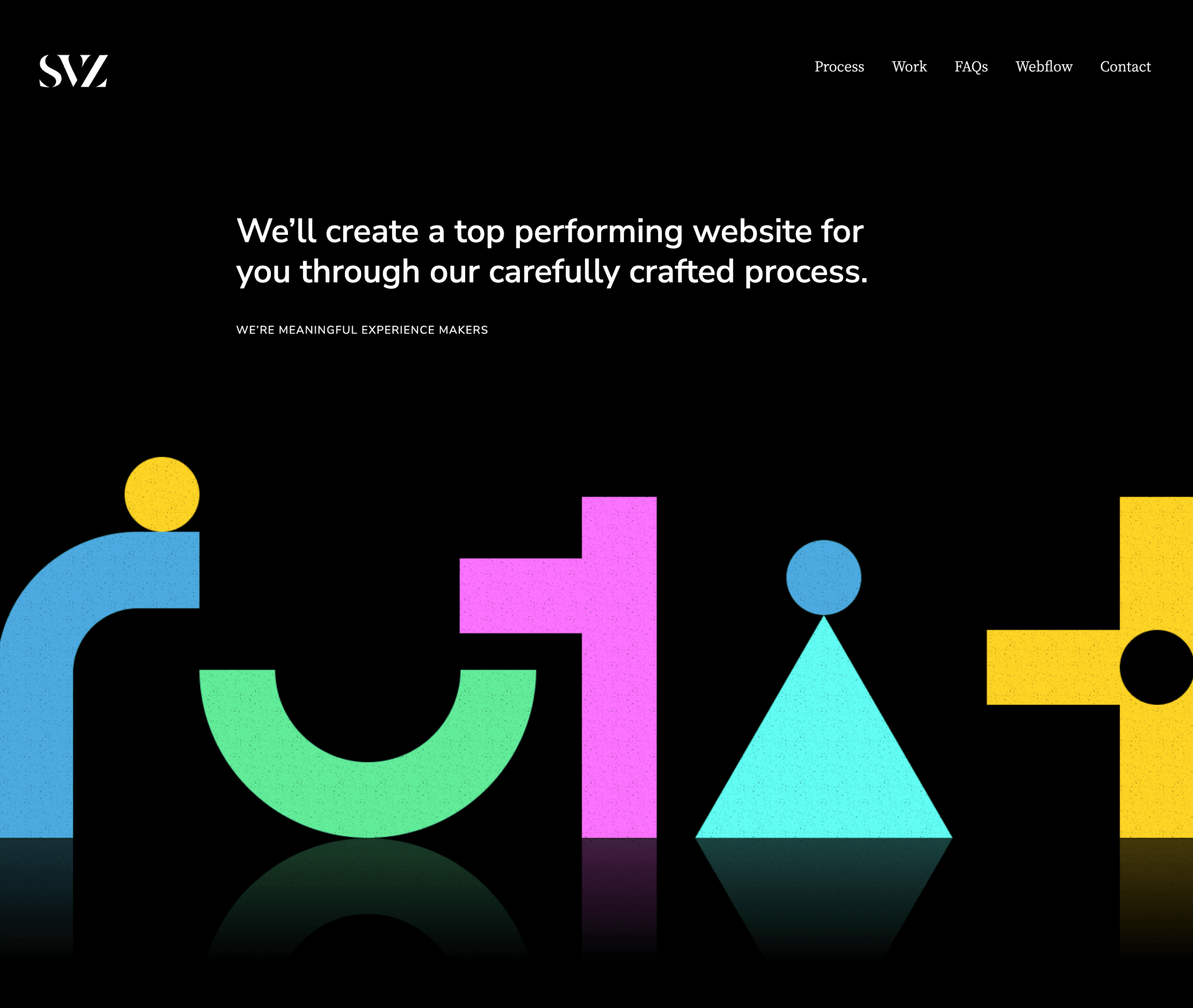
- No hero images
- Mega Footers
- Gender-neutral design
- Moving Type
- Linework
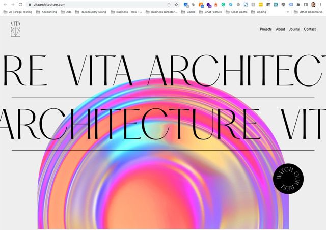
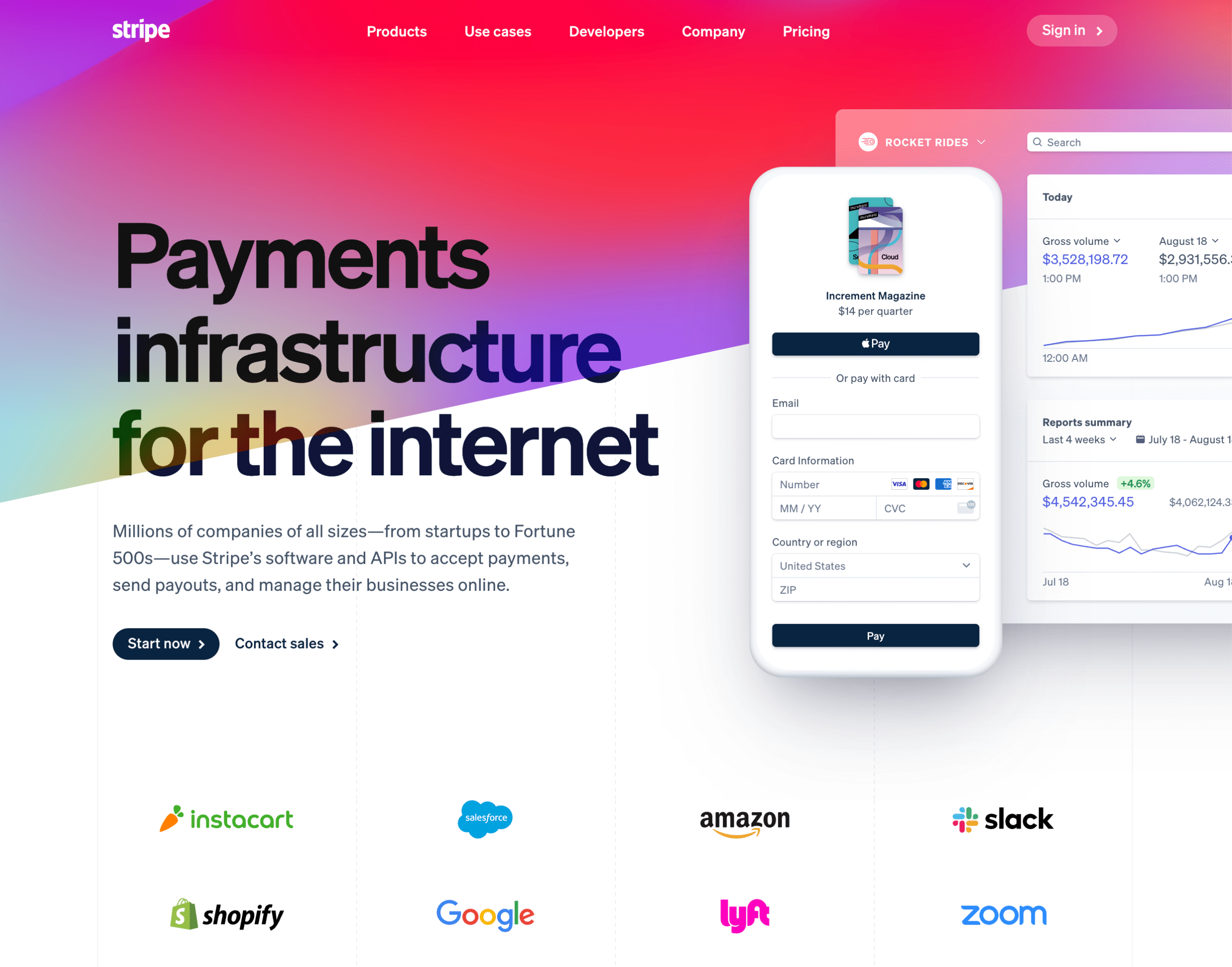
- Rich Gradients
- Layered Effects
- Dynamic Content
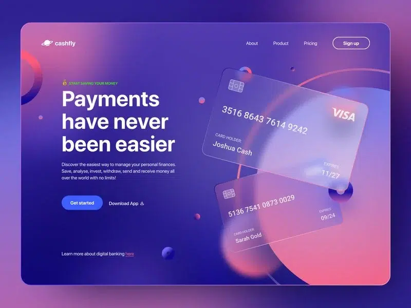
- Glassmorphism
1. One-page websites
One-page websites aren’t a new concept. Its been around since 2015. The idea sparks the trend that less is more and the ability to tell your story quickly. Usually, these sites forgo menus and navigation. It’s hard to tell a story if you have to click around too many pages. It’s much easier to keep scrolling a page and answer top questions. Often, these are an excellent fit for microsites that may want to highlight a company’s big milestone anniversary, a portfolio site, and an advertising landing page for marketing a product or service.
When to use it?
2. No hero images
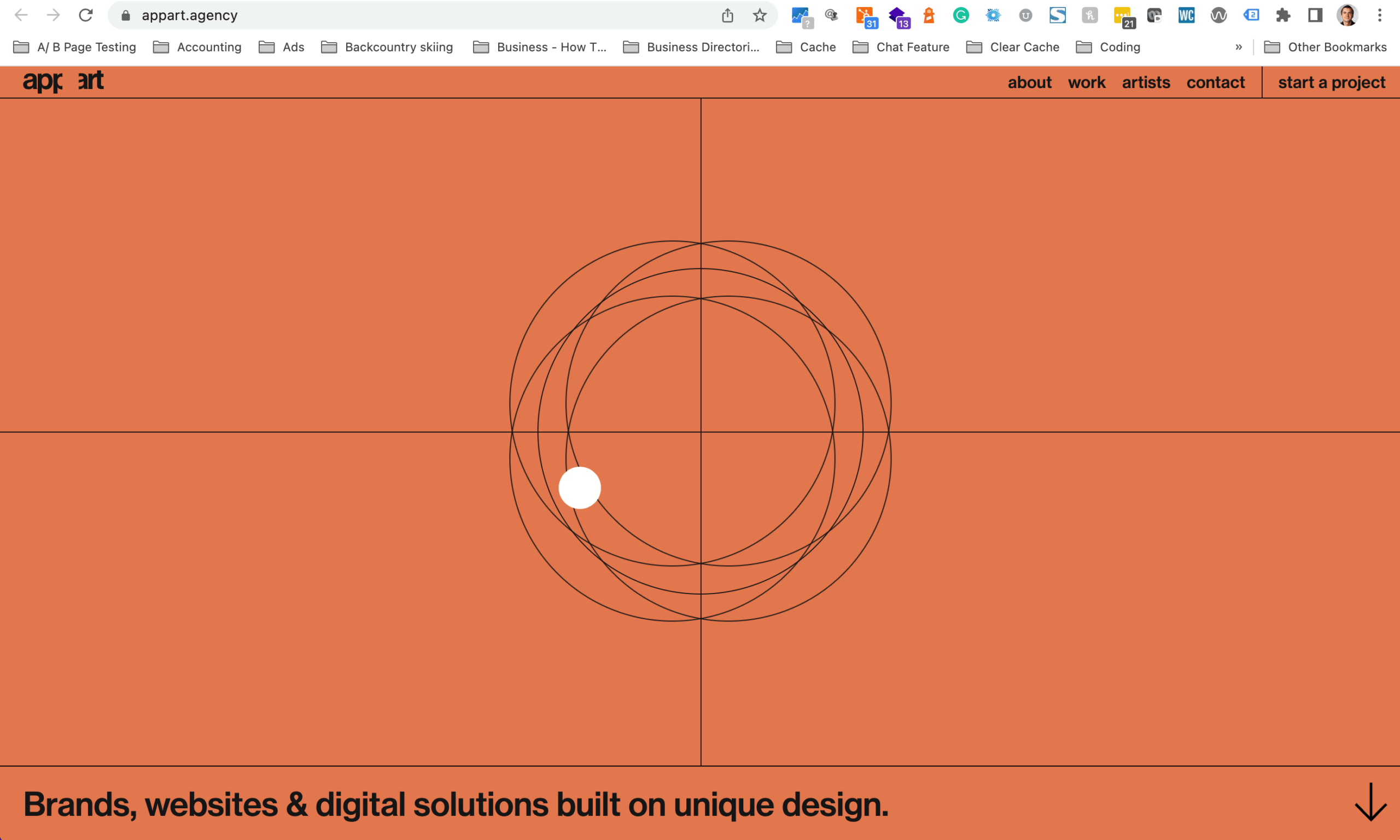
Hero images are the first image banner you see on a web page. In 2022 web designers will use typography and design to communicate their stories rather than relying on photography. A nice image brings visual interest, but resorting to stock photography is often a poor choice. Communicate your ideas with more clarity using text. Interlace it with design treatment and layout for truly a captivating experience.
How to use it?
3. Mega Footers
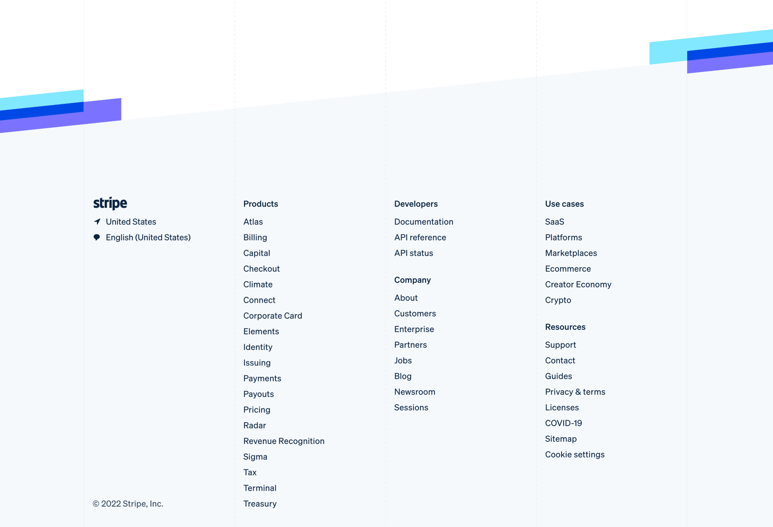
A larger web design trend of 2022 is the use of mega footers. The footer carries over this concept, similar to a mega menu, typically with 3-4 columns of menu links grouped by categories. Things to include are copyright information, a link to your privacy policy page, social profile links, an opt-in email form, and menu links grouped by categories.
Are Footer links important for SEO?
Internal linking for your website is important for helping your users navigate your website naturally and SEO. Search engines want to understand whether you’ve added footer links only for SEO purposes or if they exist to help the end-users as they navigate your website.
For example, if you have 80+ footer links pointing to various location pages, Google may notice and penalize you as these links are clearly set for SEO only and not the end-user.
Why use it?
4. Gender-neutral design
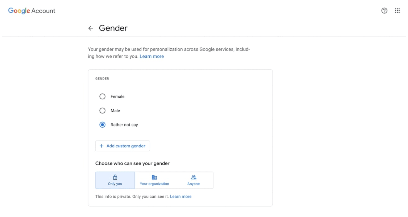
Gender-neutral design is becoming a standard trend. Creating access standards for male and female users is the first step in looking outside societal assumptions. When writing content, the new normal is to opt for they rather than him or he when a gender is not specified.
Try not to make assumptions about the people who visit your website. Such as their interest based on gender.
How to use it?
7. Rich Gradients
Gradients aren’t new, but this format is for 2022 in a new, more mature format. Rich gradients are becoming one of the dynamic web design trends in contemporary web design and are often used to add deepness to flat images. In 2018 Instagram brought the trend back with its gradient logo. Since then, gradients have evolved with interactivity and imagination. Using rich gradients is a very good option if you are designing a minimalistic design.
Why use it?
8. Layered Effects
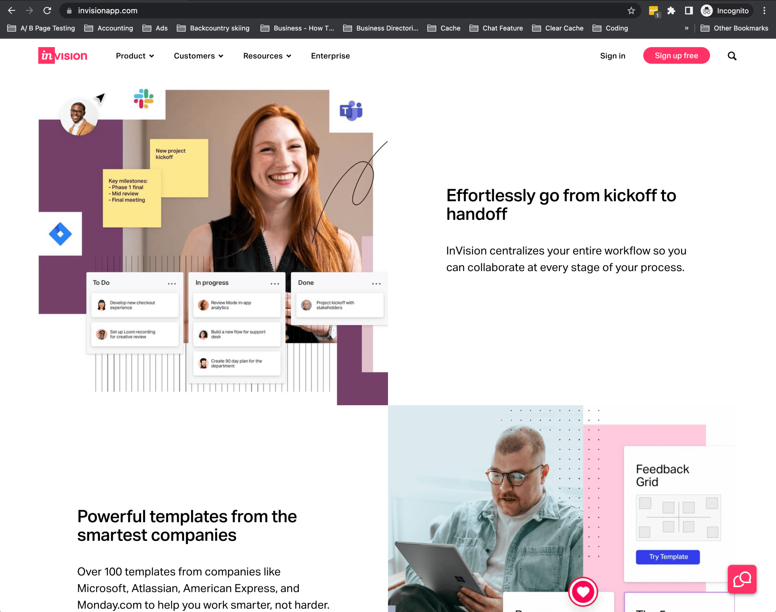
A great way to show off a custom design is by creating a layered effect with design treatments, photography, and icons that stack and overlap. This effect frequently draws the desired impact of visual interest in a meaningful way.
Using the example of InVision, you can see they have done a beautiful job of combining product screenshots with icons and photography to create an immersive experience to telling the website story.
When to use it?
9. Dynamic Content
Dynamic content is the content stored in the website database, which can be used on any page on your website. You can, for example, display a featured blog post on your product or service page without having to go into the page to update the content. This content can be automatically populated and updated as you add a new featured blog post.
The content must be added once into your content management system but could be displayed on multiple pages dynamically. Dynamic content is excellent for anyone developing a website with constantly changing content like blog, portfolio, projects, team members, products, press releases, news, or events.
When to use it?

10. Glassmorphism
Glassmorphism is a new trend on the block that is quickly growing. Glassmorphism is a trend used to describe UI design that emphasizes light or dark objects placed on colorful backgrounds. A background blur is placed on the objects, allowing the background to shine through, giving it the impression of frosted glass.
The main thing about this technique is diffusion, reflection, and shadow, which create an optical illusion. The glass effect can make a site feel 3D when combined with subtle movement. The “frosted glass” diffusion within the image allows you to incorporate transparency into your design without feeling too visually cluttered.
Here are some inspirational Glassmorphism designs to get your creative juices flowing.
When to use it?
To wrap up 2022 web design trends
We always enjoy writing these articles on trends and trendsetters after doing the heavy lifting for you with a large mix of websites. As you consider your website project, it’s good to keep in mind these design trends. While it’s important to stay updated in our evolving world, paying attention is equally essential.
Web designers are more likely to have a method of producing different web designs with keeping accessibility and intuitive navigation in mind that engages with visitors in a unique yet influential way. Explore how they can enhance your brand story.
Need help taking advantage of these and other trends in your next website refresh? See our professional web design service along with our web design portfolio.
Are you interested in how these 2022 web design trends compare to the past?
Learn the Correct Web Design Process
Get a one page PDF on what a professional web design process looks like. Fill out the form below.

Learn the Correct Web Design Process
Get a one page PDF on what a professional web design process looks like. Fill out the form below.

