Web design trends are constantly fluctuating. As a result, this is an ever-evolving field. As in any other walk of life, innovation in web design comes from looking into the present trends and how they may develop in the future.
Technology plays a vital role in the web design process and can provide a platform for new ideas and innovations. Animation, interaction, and immersion allow you to express your imagination.
This article will discuss some of the most forward-thinking design trends we expect to see in 2023. These include things like:
- Behavioral design
- Voice optimization
- Thumb-friendliness
We will also talk about several established trends, like quick load times and bold typography, which we expect to continue going strong in 2023 and beyond. Let’s get started!
Read more about previous web design trends and UX principles:
- 2022 Web Design Trends
- 2021 Web Design Trends
- 2020 Web Design Trends
- 2015 Web Design Trends
- 2013 Web Design Trends
- 22 User Experience Design Principles for Websites
Below are some inspiring web design trends for 2023 that are sure to increase engagement and conversions on a website.
- Behavioral Design
- Quick Load Times
- Thumb-Friendliness Mobile Navigation
- Voice Optimization
- Accessibility
- Artificial Intelligence
- Catchy Color Palettes
- Videos
- Micro-Interactions
- Focus on User Experience (UX)
- Lazy Loading
- Eye-Catching Fonts
- Negative Space and Visual Borders
- Blur Effects
- Symmetry
1. Behavioral Design
If you weren’t very physically active before the advent of fitness apps, you’re not alone. Many people have been motivated by these applications to keep track of the calories they put into their bodies through food and those they burn through various forms of physical exercise.
The apps motivate us to maintain our positive habits by rewarding us with badges, coins, and achievement trophies. That’s behavioral design at work. Users are more likely to engage with an experience if it is interesting enough to trigger the desired behavior.
As you interact with these apps or sites, you take specific actions, develop habits, and engage in certain activities (meditation, cycling, language learning, walking, etc.). The behavioral design combines technology and psychology with innovation and creativity to discover what makes people behave the way they do and helps them change their habits for the better.
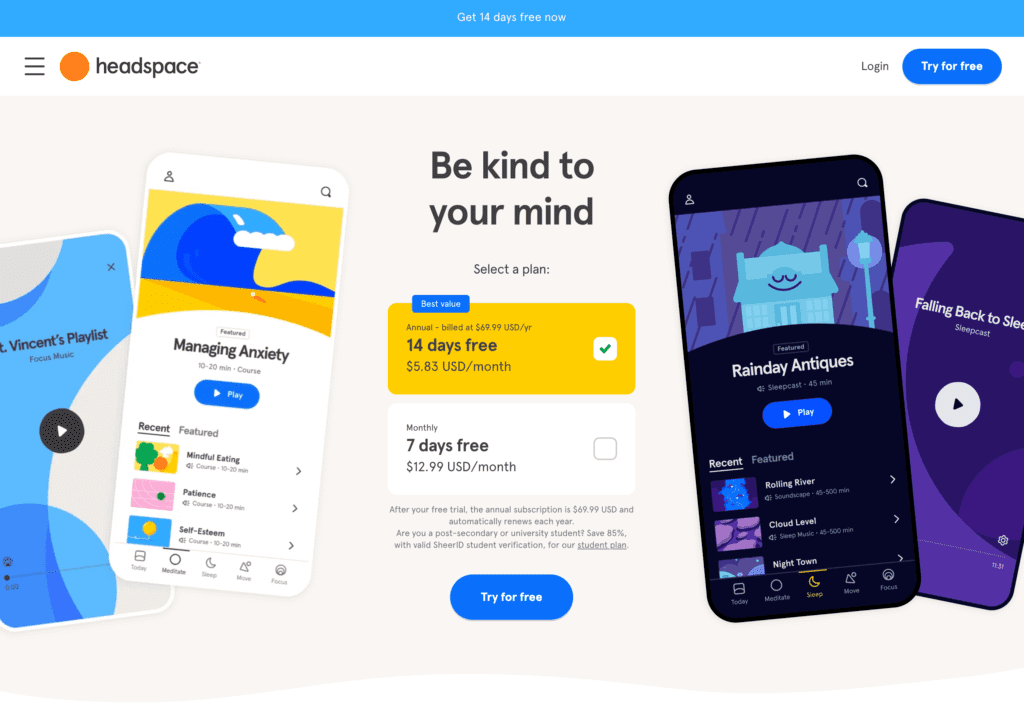
The popular meditation app Headspace is an example of a product that incorporates behavioral design thinking. By encouraging users to meditate daily, the platform can keep them coming back.
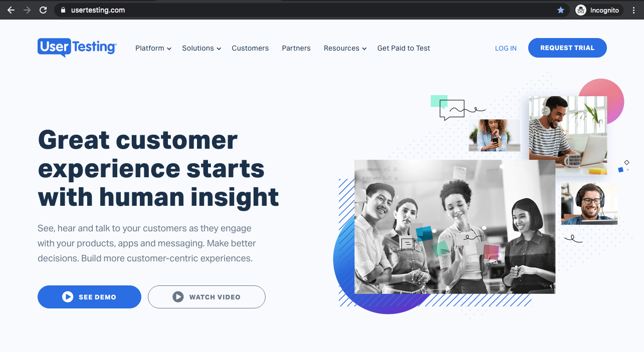
When it comes to behavioral design, it is all about triggering user behavior through visual cues. For example, on the ConvertCart and GiftRocket homepage, rocket and hand illustrations draw users’ eyes toward their primary list of features and services. The best designers achieve this with the help of science and established behavioral design principles.
When to use it?
2. Quick Load Times are Still Important
Speed is an important web design standard. Loading times have been critical in UX and SEO for years, and they continue to be a top priority.
Although page speed is hardly a new trend, it is worth putting in a list like this because it will not go anywhere anytime soon. That’s why you need to consider it whenever you’re looking to:
- Build a brand-new website
- Launch a site update
- Create a new page design
If you ignore loading times in your web design efforts, you risk losing a lot, including search engine rankings, traffic, conversions, etc.
Search engines like Google now evaluate the page speed of a website. It measures how quickly a page loads and how soon it becomes available to users using Core Web Vitals and other factors.
Here are some steps you can take to improve page speed:
You can also outsource your page speed optimization efforts to save valuable time and effort for your in-house WordPress development team.
3. Thumb-Friendliness Mobile Navigation
Remember your mobile audience as you adapt to next year’s web design trends. Increasingly, mobile is replacing desktop when it comes to browsing the web — making your site thumb-friendly will be a big focus this year.
People typically scroll, click, and navigate websites on smartphones using their thumbs. It is essential to add and place elements on your site where a user’s thumb can easily reach them.
Typically, mobile sites have hamburger menus (the three-line icon at one of the top corners of a page). In most cases, this menu is at the top left. Assuming a reader is holding their phone with both hands and they have an average-sized screen on their smartphone (6+ inches), they can’t reach the top left (or top right) of the screen using either thumb.
For mobile users, the hamburger menu may need to be moved to a different place, like the bottom right corner. This way, your mobile audience can browse your site faster and more efficiently.
Things to keep in mind:
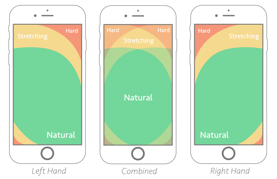
Thumb zone mapping for left- and right-handed people. The “combined” zone shows the ideal placement areas for most users
4. Voice Optimization
Globally, voice assistants are expected to generate $19.4 billion in e-commerce transactions by 2023. This is a 400% increase compared to just two years ago, and it is caused by the increased use of voice assistants to purchase items, mainly through smartphones and smart home devices, which makes voice optimization one of the most important web design trends at the moment.
Websites are increasingly optimized for voice searches today, and the same will be true in 2023. Your website must be optimized for voice search to rank well in search results.
You’re probably well aware that your website can only funnel highly qualified traffic with great search engine rankings. No matter how beautiful a website you design, it might go unseen if you don’t rank high.
Natural language processing (NLP) is becoming increasingly important for websites to reach all audiences, including those who search by voice, through assistants Siri and Alexa. Get the most out of voice integration by working with a reputable voice search optimization team!
How to optimize my e-commerce website for Voice Search?

7. Catchy Color Palettes
Your website’s color palette is one of the first things you should reconsider in the new year. A website’s colors greatly influence the audience’s perception of a brand, and the color palette plays a significant part in a company’s identity and its strategies for brand awareness.
People will associate your brand with your colors. They’re an essential aspect of your business, so keep them up-to-date and fresh.
The use of bright colors is a big website design trend for 2023. Colors catch your audience’s attention and keep them engaged. If you think your color palette has started to look a bit old and dreary, now’s the time for a change.
Make your website pop by choosing brighter colors. This is a great way to make your website stand out with a unique and fresh look.
Another upcoming trend involves black and white palettes with brightly colored accents. These create a unique experience for your users, allowing them to see the site in an entirely new light. The critical elements and points of interest on the page will stand out with these accent colors, and the black-and-white base allows you to go a bit crazy with the shapes and textures as well.
A black-and-white palette also allows you to “mark” different parts of your website with different accent colors facilitating navigation. Think of how colors are used to map out different hiking paths and bring a similar approach to the design of your website, highlighting various points of interest. Your users will thank you for it.
If you’re not up for a massive design change, at least take another critical look at your color palette and ensure it still resonates with your audience.
8. Videos
As video platforms like YouTube, TikTok, and Instagram Reels grow in popularity, businesses should look to make video a more significant aspect of their websites. Adding more videos to your site will create additional engagement points and help you stay competitive.
This breaks up the textual content on the site and creates diversity on each page. Videos are also perfect for on-the-go audiences. It may not be possible for them to read the entire contents of a web page, but a two-minute video can give them everything they need to know.
With Google now displaying mixed results that include more and more videos, now is the time to start incorporating videos into your marketing strategy. As a result, you gain more exposure and engage new leads.
When to use it?
9. Micro-Interactions
Micro-interactions are small events that happen during a user’s visit to your site. They occur when a visitor takes a small action and receives a specific response.
An example of a micro-interaction would be logging into Facebook and seeing a red box with a number next to your notification icon. The user will find this engaging and most likely click on the notification icon to see what happened while they were away.
Twitter has many micro-interactions as well. For instance, you will hear a popping sound each time you refresh your Twitter feed.
You can add these small nuances to your website to enhance the user experience. Scroll animations, chimes, and other micro-interactions can be integrated into your site to engage visitors. Next year, your website’s design will stand out more if you use this technique to create a more engaging and interactive experience.
When to use it?
10. Focus on User Experience (UX)
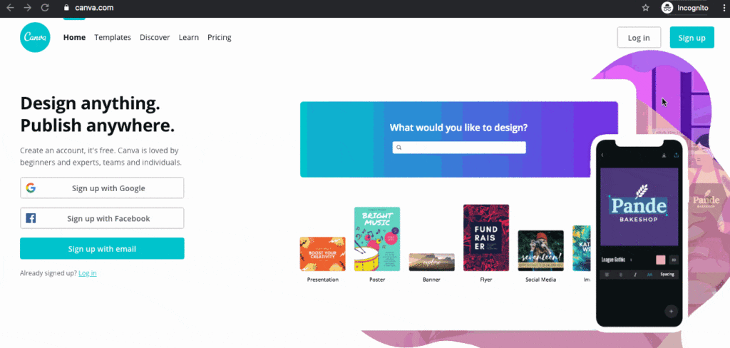
You must put your audience at the center of your business. A positive user experience (UX) on your site will incentivize your audience to stay on the page and discover more about your business. What kinds of elements would enhance their experience on your site? Think about what they’d like to see.
When designing your site, you should always consider how your audience will react to the information and media presented, as well as your choices regarding typography, navigation, color, etc.
The quality of the user experience makes the difference between gaining and losing leads. It does not matter how beautiful your website is and how well it represents your brand if the user experience is not optimized. Keep your audience’s interest by optimizing your UX next year.
11. Lazy Loading
We’re all guilty of creating a resource-heavy website or two with lots of graphics and third-party integrations. The good news is that there are now many ways to design smart websites that only load the content the user needs to see.
There is nothing new about lazy loading and infinite scrolling. Most social networks have used these features for years. The approach is also prevalent for websites with long (one-page) content.
Implementing technological advancements could help any website outrank or outperform its competitors. Your conversion rate and ranking can increase as a result of these features, which enhance the user experience for all site visitors.
Using lazy load, web browsers (like Google Chrome, Safari, and Firefox) will only download content you see on screen without wasting time or server resources loading offscreen content.
Most website visitors never get to the bottom of a webpage. If so, what’s the point of loading that content and increasing site load times? Loading the content as the user scrolls down the page and gets closer to it is a much more effective approach, and we expect to see it implemented on more websites in 2023.
12. Eye-Catching Fonts
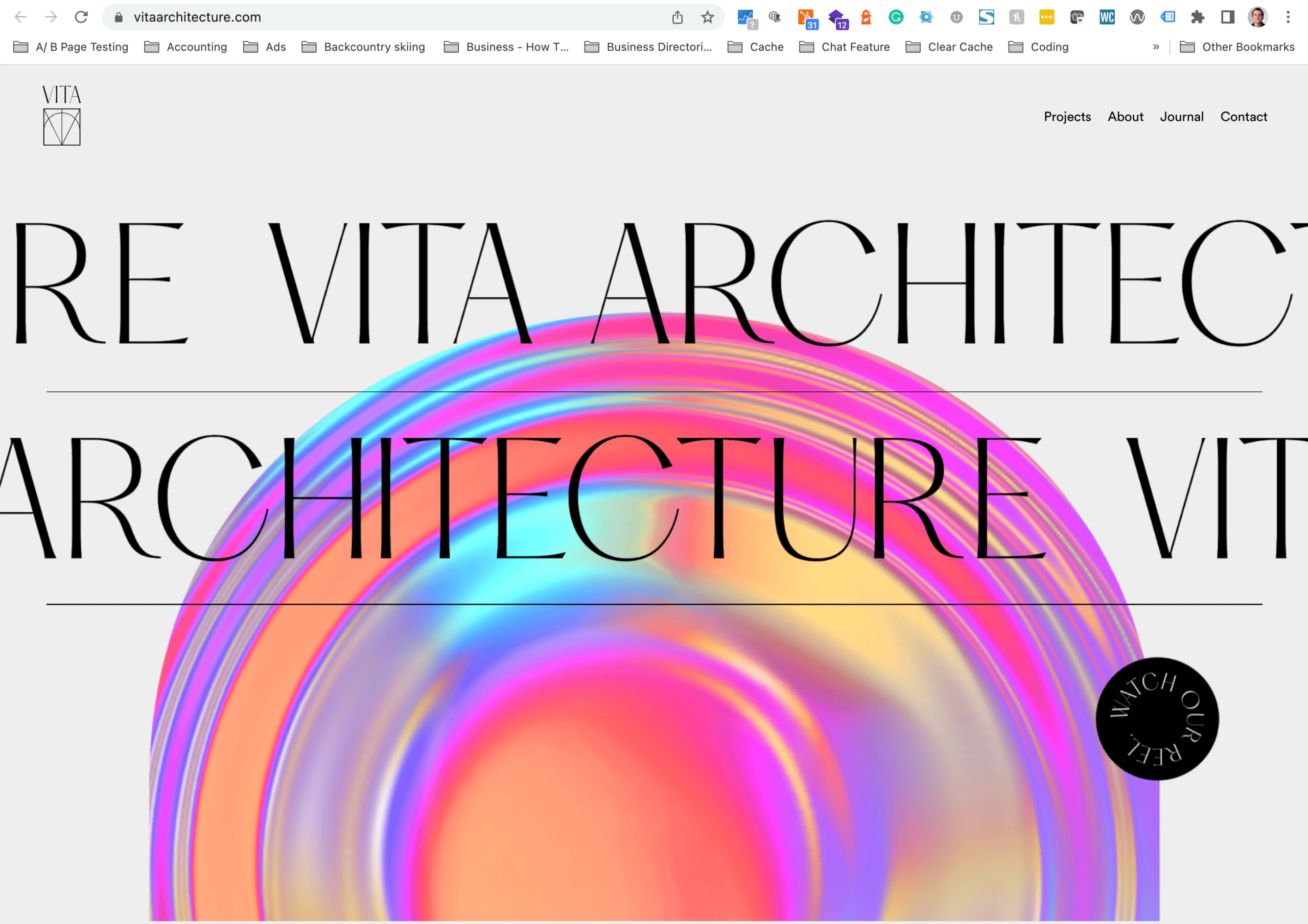
Web typography has become increasingly bold and eye-catching in recent years. Design professionals can create attention-grabbing messages by using stylish fonts. The use of this trend in headlines and calls to action is particularly effective.
As social media has grown in popularity, brands have used striking visuals to attract scrollers’ attention. Bold typography can be a powerful way to catch your audience’s attention, but it should be used sparingly.
An overly busy page can be confusing and off-putting if every element shouts for attention. It is possible, however, to make your words stand out when you use this approach judiciously. Working closely with content writers is always a good idea to ensure you have punchy headlines and succinct content so the typography stands out.
On the other end of the spectrum, lightweight typography has also gained traction recently. These styles use thin, delicate fonts that are easy to read and do not take up much bandwidth. This makes them especially suitable for mobile devices.
A lightweight font may also be available in multiple weights (e.g., light, regular, bold), giving designers greater flexibility in creating an information hierarchy.
The small decorative details on serif fonts had made them popular for centuries. However, early web users found these typefaces challenging to read on-screen, so they went out of favor. With today’s high-resolution screens and devices, serif fonts are easier to read, and this has resulted in them making a comeback in web design.

13. Negative Space and Visual Borders
Websites are becoming increasingly complex, so white space helps organize content and create a professional image. In addition, borders can be used to create a sense of space on a page, making it appear as if the website is floating within the screen’s confines.
You can achieve various looks with visual borders, from funky and fun to clean and corporate, so we expect to see more and more designers utilize this approach in 2023. If you don’t want to be left behind, keep this web design style in mind when developing your website.
14. Blur Effects
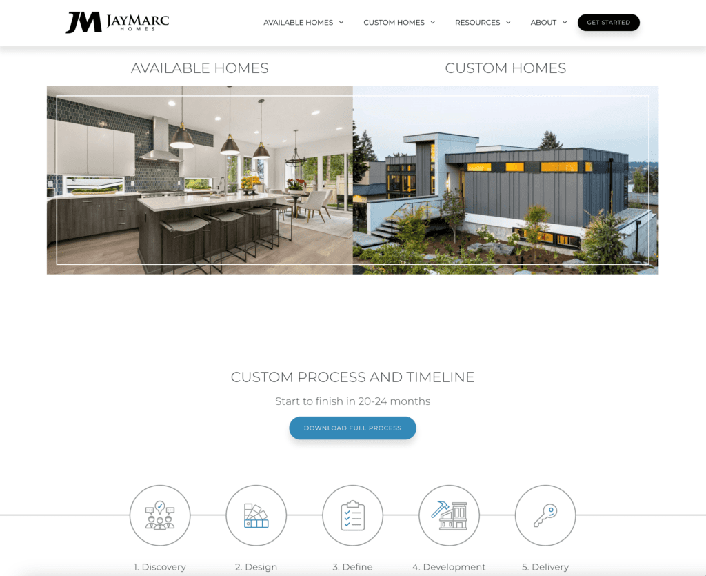
The blur effect can add depth and dimension to an image. This design trend can be particularly eye-catching when combined with other interesting design elements, such as color gradients and lazy loading.
Further, blur effects can help viewers focus on essential content by reducing distractions. For example, an important news article on a municipal website could be highlighted using a blur effect if you want people to focus on it more than the rest of the content.
More designers will likely experiment with blur effects during the coming year to engage and connect with their audience.
15. Symmetry
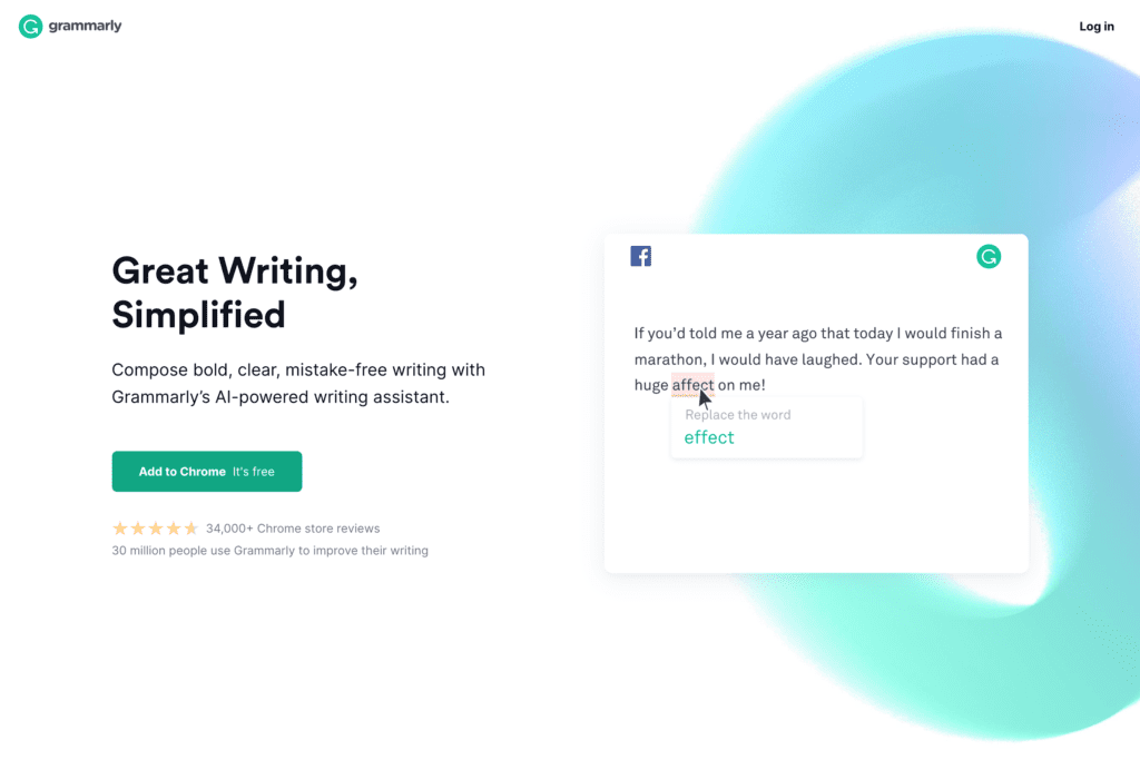
A symmetrical layout is pleasing to the eye and creates a sense of order. An aesthetically pleasing, balanced design can provide visual stability and calm in an information-rich world.
Today, most websites feature asymmetrical layouts. However, symmetrical arrangements will likely return as user experience becomes increasingly important. It is easier for users to find the information they need when the configuration is balanced.
Designers are likely to continue using symmetry in web design as they strive to create user-friendly websites.
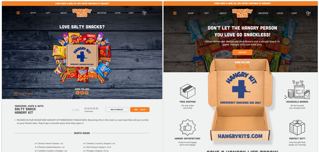
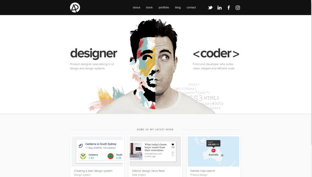
To summerize 2023 web design trends
The modern internet user expects an accessible and easy-to-use website. Keeping your website updated will help you build trust with your customers and make them more likely to stay on the site longer. Otherwise, your site may fall out of favor with search engine algorithms, resulting in lower rankings.
Implement the trends discussed in this post to ensure your site is up-to-date. Using these tips, you can ensure your website is both user- and search engine-friendly.
Looking to take advantage of these trends? See our professional web design service along with our web design portfolio.
Are you interested in how these 2023 web design trends compare to the past years?
Learn the Correct Web Design Process
Get a one page PDF on what a professional web design process looks like. Fill out the form below.

Learn the Correct Web Design Process
Get a one page PDF on what a professional web design process looks like. Fill out the form below.

