Website Redesign Project Plan: The Complete Step-by-Step Guide (With Free Checklist)
Website Redesign Project Plan: The Complete Step-by-Step Guide (With Free Checklist)
Introduction to Website Redesign
A website redesign is one of the biggest investments you’ll make in your business. Get it right, and you’ll increase leads, improve conversions, and build a platform that grows with you. Get it wrong, and you’ll waste months and thousands of dollars on a site that doesn’t perform.
That’s why you need a website redesign project plan.
This guide walks you through every phase of a successful website redesign, from initial audit to post-launch optimization. We’ve included a comprehensive checklist, timeline breakdown, and free templates so you can plan your project like a pro, whether you’re managing the redesign internally or working with an agency.
Whether you’re looking to redesign your entire site or refresh your web presence, this website redesign template covers everything you need to know.
- Improve your customers’ impression, trust and credibility of your brand
- Tell your brand story in an easy-to-understand way
- Drive more traffic
- Convert more of that traffic into business leads or revenue
- Help your site be the hub for marketing initiatives
- and many more
However, no matter if it’s a tweak or a complete overhaul, a website redesign project is a big undertaking that’s filled with risks. Making a detailed project plan that accounts for goals, timeline, cost, and curveballs is the first step to really getting a project off the ground. Read this article to understand every aspect of a website redesign and making a plan, plus get free templates and a website cost calculator to make your plan a success!
Why You Need a Website Redesign Project Plan
Planning isn’t glamorous, but it’s essential. Without a solid website redesign project plan, you’ll face missed deadlines, scope creep, unexpected costs, and a launch that damages your SEO.
Here’s what a good plan does for you: it keeps everyone aligned on goals, identifies risks before they become problems, protects your search engine rankings, and ensures your redesign actually improves business metrics instead of just making things look pretty.
According to industry data, 50% of website redesigns fail to meet their original goals. The difference between the winners and the losers? The winners had a plan.
This website redesign checklist and project plan template will help you be in the winner’s circle.
Before you dive in yourself, it’s a good idea to get the lay of the land. Plenty of companies have gone through website redesigns, so use these statistics to avoid making assumptions:
- 75% of people judge business by its website (Stanford)
- 51% redesigns launch late (Hubspot)
- 63% redesigns go over budget (Hubspot)
- 79% of marketers recommend refreshing web design at least every 24 months (Hubspot)
- 33% people not happy with their redesign outcome, for a variety of reasons (Hubspot)
Website Redesign Checklist: Your Quick-Reference Guide
Before we dive into the detailed steps, here’s a comprehensive website redesign checklist you can use throughout your entire project. Print it out, share it with your team, and check off items as you complete them.
Pre-Redesign Audit Checklist
- Document current website analytics (traffic, bounce rate, conversion rate, top pages)
- Identify top performing content and pages
- Analyze current user behavior with heatmaps or session recordings
- List all pages currently on your site
- Document current keyword rankings for 20+ target keywords
- Review Google Search Console data for clicks, impressions, and errors
- Test current site functionality on mobile, tablet, and desktop
- Document all forms, integrations, and third-party tools
- Create a backup of all current content and images
- Export your current URL structure and internal linking map
Strategy and Planning Checklist
- Define clear, measurable redesign goals (traffic, leads, conversions)
- Document your target audience and create buyer personas
- Analyze 5+ competitor websites
- Map current user journeys and identify friction points
- Identify and assess project risks
- Set realistic timeline and budget
- Choose your CMS platform
- Plan your information architecture and sitemap
- Create a content inventory and identify gaps
- Establish stakeholder communication plan and approval process
Design Phase Checklist
- Create wireframes for top 10 pages
- Get stakeholder approval on wireframes
- Build visual design mockups for key pages
- Establish design system and component library
- Define typography, color palette, and spacing guidelines
- Create mobile-first responsive designs
- Get final approval on all design mockups
- Create designer-to-developer handoff documentation
- Plan for form design, CTAs, and conversion elements
- Document accessibility requirements (WCAG compliance)
Development Phase Checklist
- Set up development environment and staging server
- Create 301 redirect map for URL changes
- Implement content management system
- Develop all template pages and components
- Set up forms and integrations (email, CRM, analytics)
- Implement SEO elements (titles, meta descriptions, schema)
- Install analytics tracking (Google Analytics, conversion pixels)
- Configure SSL/HTTPS security
- Set up backup and recovery systems
- Create documentation for site maintenance
Launch Checklist
- Complete all content migration
- Test all pages, forms, and functionality
- Verify all 301 redirects work correctly
- Test analytics and conversion tracking
- Perform speed and performance testing
- Test on all browsers and devices
- Check spelling and grammar throughout site
- Get final stakeholder approval
- Schedule launch window with minimal traffic
- Brief support team on changes
Post-Launch Checklist
- Monitor website uptime and performance
- Check Google Search Console for crawl errors
- Verify analytics are tracking properly
- Monitor email forms and lead notifications
- Track initial traffic, bounce rate, and conversion changes
- Gather user feedback
- Fix any reported bugs within 48 hours
- Create content update schedule
- Plan ongoing optimization and A/B testing
- Review first 30-day metrics against goals
Overview of Your Redesign Plan
Start off with this checklist of steps and factors for your website redesign project plan. We’ll go into each in much greater detail throughout the article, so if you see a section that you want to explore more, just click it to see that part of the article. Plus, if you need to share the checklist with your team and other stakeholders, you can download it here.
1. Measure Analytics:
Note your core metrics, like traffic, conversions, and bounce rate to understand what you need to improve and give yourself a baseline to measure against.
2. Set Goals:
Working from your analytics and input from your stakeholder team, decide what the purpose of the redesign is. This helps you assign it a value to assess return on investment (ROI), and keeps expectations in reality.
3. Assess Risks:
Tie risks to potential timeline interruptions affecting your project team, budgetary concerns, and most importantly, your site’s functionality. During development and transition, core functions might not work—can your customers and business manage in the interim, and do you have a contingency plan?
4. Plan Costs:
Budget out the project in full, and add space for discovering problems and new things you need mid-project. Planning for things to go perfectly is setting yourself up for frustration.This again helps you assess potential ROI, but also helps you determine what kind of help you’re using and manage the expectations from your decision-makers.
5. Build Strategy:
Everything on the site should serve the goals of your business in some way—by planning out an acquisition and conversion strategy up front, you can focus on the essential pages and functions first.
6. Identify Personas:
There’s who you think your customers are, who you want your customers to be, and who they actually are. Use a combination of customer/sales staff conversations, analytics, and interviews and surveys to really figure out who you’re targeting.
7. Choose Platform:
Very few businesses create a website entirely from scratch, namely because a custom backend for the site isn’t manageable without the help of developers, which drives up maintenance costs. Popular platforms include WordPress, Squarespace, and Wix.
8. Make Sitemap:
The sitemap is a map of all the pages on your website, including what pages live under what organization in navigation and menus. This should tie into your strategy, targeting the journey of each of your personas.
9. Gather Content:
The copy (words), the images, and videos that populate a site are important to the overall experience and effectiveness of the site. Your content not being ready in time is also responsible for the majority of website redesign projects going off the rails. Assign someone specifically to this task now while the design is underway.
10. User Experience & Wireframes:
Building from the sitemap, you need to plan the user experience (UX) as they travel through the site towards the goals you want them to complete. Capture it in simplified sketches to help your web designers and developers understand the plan and prevent costly extra work.
11. Design & Visual Assets:
Have a vision in mind for the overall look and feel of the new website, including what elements from the existing brand will be pulled forward, and what need rebranding. Tie it into the strategy, and have lots of examples from sites you like that the web designers can use as a reference.
12. Search Engine Optimization (SEO):
SEO is both a technical and creative practice, helping your website draw in organic traffic from Google and other search engines for terms relevant to your business. It really can’t be done well without expert advice, so plan this as part of your budget, and also make sure the platforms you use have some back end SEO features.
13. Pick a Partner:
If you’re reading this, you’re most likely not a developer, which means you’re going to need help. Using your goals, strategy, and budget, determine whether you’re going to try to DIY with a drag-and-drop site builder, hire one or more freelancers, or hire a web design agency in Seattle to help you pull it off.
Research your options carefully and launch a Website Design RFP (Request for Proposal).
1. Analytics and Metrics of Your Current Site
What’s working and what isn’t
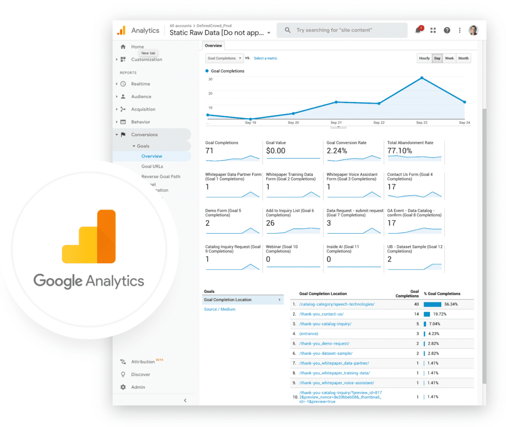
The first step before committing to a website redesign project is understanding your current website. After all, how can you even set goals if you don’t know where you’re at? Once you analyze some key metrics to understand what’s working and what isn’t, you will be able to decide what you want a new website to do for your business. And once it’s complete, these metrics will form a baseline you can compare against.
Installing Google Analytics
If you don’t already have a website analyzer, you can always rely on the most popular free option, Google Analytics. Just install it following their official instructions. Some popular website builders have built-in methods of installing it: here are guides for Squarespace, WordPress, and Wix.
Key Metrics to Analyze
With these key metrics in place, you can start thinking about what you want to improve and prioritize in a website redesign project plan.
2. Goal Setting For Your New Site
Not to be confused with on-site goal completions, the goal of your website redesign should be what tangible and intangible things you want to achieve. You might have multiple, or even all of the examples below—be sure to use those as a guidepost as you prepare your budget, timeline, and other key parts of your project plan.
Common Website Redesign Goals

Not sure where to start?
Download this Website Redesign Questionnaire to figure out what goals your business should be pursuing.

Not sure where to start?
Download this Website Redesign Questionnaire to figure out what goals your business should be pursuing.
3. Risk Assessment for Redesigning Your Website
Because website redesigns are massive projects, they can come with a wide variety of risks that need to be considered when planning them. Review this risk checklist, and download it here if you need to share with other stakeholders.
Downalod the Risk Assessment Checklist
Because website redesigns are massive projects, they can come with a wide variety of risks that need to be considered when planning them.

Downalod the Website Design Risk Assessment Checklist
Because website redesigns are massive projects, they can come with a wide variety of risks that need to be considered when planning them.
4. Set Your Website Redesign Budget
Budget without guessing. You need real numbers.
Website redesign costs vary wildly based on size and complexity. A simple redesign of a 5-10 page site might cost $5,000 to $15,000. A mid-size business site with 10-20 pages typically runs $15,000 to $50,000. A complex ecommerce site or application could easily exceed $100,000.
What does that budget actually cover? Design hours, development hours, project management, testing, and content creation. Most of your budget goes to people time, not software.
Create a detailed budget line item document: design fee, development fee, content creation, imagery, licensing fees, hosting setup, domain registration, SSL certificate, third-party integrations, training, and contingency buffer (always add 10-15% extra).
If you’re working with an agency, get a detailed proposal that breaks down all these components. If you’re managing it internally, estimate realistic hourly costs for each team member working on the project.
Don’t skimp on content creation and copywriting. This is where many redesigns fail. You’ll need: new homepage copy, service page copy, about page content, meta descriptions for 20+ pages, and possibly new blog content. Budget 20-30% of your total redesign budget for content.
Also budget for ongoing optimization after launch. You won’t get everything right on day one. Plan for A/B testing, heatmap analysis, and quarterly improvements.
Check out our complete guide to website redesign costs for detailed pricing by project type.
Key Factors to Website Cost:
| What Kind of Help | Type of Website | Visuals Needed | Advanced |
|---|---|---|---|
| Working on your own If you don’t account for your time, you can get what is technically a website up on Squarespace or Wix on the cheap. | Brochure marketing site The cost depends on the number and complexity of pages in a design. If your site just displays product and service information, and a way to contact you, it’s a brochure site. | All content ready You have the images and videos you need for the site ready to go. It just needs to be designed and laid out. | Blog / Projects Blogs and Projects/Case Studies are custom post types that allow you to easily manage and add your content on the backend. They need to be dynamic and filterable by category and search. |
| $12-$49/ mo. | $10,000-$20,000 | $3,000-$15,000 | $1,000-$5,000 |
| Hiring a Freelancer Hire a web designer or developer to get the professional touch, but remember that they aren’t a jack of all trades, and can’t be skilled at everything your website redesign might need. | Membership site If your site includes a portal for users and other more interactive features, you can expect a lot more to get it off the ground and maintained. | Sourcing from stock If you need to purchase stock photos, icons and videos to round out the visual content of your site, there are a range of options, make sure you have a creative brief and guidelines for brand consistency and what you’re trying to communicate. | Chatbot Automated chatbots and live chat systems for a site help users engage with customer service and navigate more easily. |
| $40-$100/ hr. | $5,000-$10,000 | $100-$5,000 | $20-$100/mo. |
| Hiring a Web Design Agency Get a seasoned team of professionals in SEO, copywriting, branding, design, and development working in tandem for the best results and accountability. Make sure they have a well-defined process, too. | Ecommerce site This can involve all of the above plus a functioning shopping cart and other types of core store features, and they tend to be labor intensive. | Original content Whether you’re hiring photographers, video editors, or infographic designers, original content is expensive, but always worth it for the end results. | Integrations Integrating custom APIs into your site to work with your existing technology stack always requires an experienced developer along with good documentation and or support. |
| $100-$200/ hr. | $15,000+ | $1,000+ | $1,000+ |
And always add 10-20% in your accounting for the possibility of scope creep. Want a more in-depth and customizable estimate? Check out our Website Redesign Cost Calculator!
5. Start with Strategy
With an estimated cost and your business’ goals for the website in mind, you can start to work on a strategy. A strategy helps you focus your efforts on the aspects of the website redesign that help your business, which helps prioritize which information you put forward and where you spend your budget. Here are the different aspects to consider:
Only when a strategy is defined can you really move forward on the project.
6. Understand Your Customer Personas
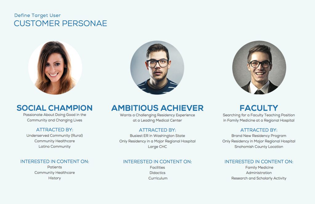
Another aspect of strategy is the people who are going to be affected by it—your customers. A Persona is an amalgamated representation of one set of your customers. Separate your core customers into a handful of unique groups, and you can start plotting out the journey of each and determine what pages and content they need to motivate each step of their buying journey.
How to Find Out Your Personas?
There’s who you think your customers are, who you want them to be, and who they really are. Use the following methods to get to the bottom of it:
7. Choosing a Platform for Functionality
Very few businesses create a website entirely from scratch, namely because a custom backend for the site isn’t manageable without the help of developers, which drives up maintenance costs. Popular platforms include WordPress, Squarespace, and Wix.
Why We Recommend WordPress
All website building tools have their quirks, but WordPress is the best long term investment for the following reasons:
- You own your site
- Most widely used and supported by 3rd party developers and companies
- Cost-effective with a large community of free plugins, and easy to work with from a development standpoint
- Easy site administration, even after your developer is gone thanks to a simple backend system
- The best blogging platform to drive traffic to your website
- Completely customizable design & functionality
- Optimized for SEO with built-in tools and plugins
8. Build the Sitemap & Navigation
Sitemaps
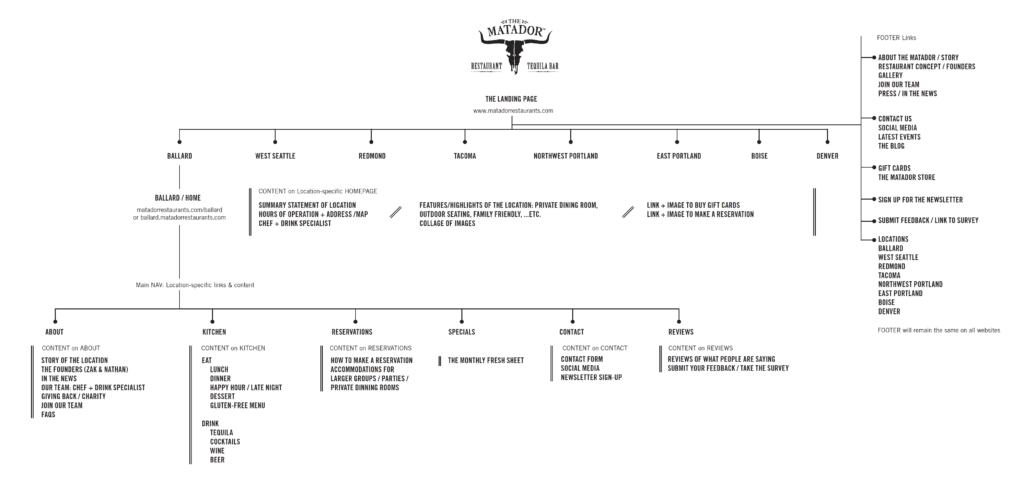
The next part of your website redesign project plan should be coming up with the sitemap. If you’ve followed along to this point, you’ll already have a strategy in mind based on business objectives and catering to defined customer personas. Each piece builds on the next to help narrow and define the endless possibilities for website creation down to a logical choice that will do its job.
A sitemap is a map of all the pages on your website, including a hierarchy of which pages live under which folders and subfolders.
Example Sitemap:
Navigation
Hand in hand with the sitemap is the top level navigation (or nav), which is the menu of pages you see at the top or increasingly on the side of most sites. Which content you feature and how you group them will follow in part from what kind of business you have, and in part from the strategy and personas you’ve pursued to this point.
For example, an ecommerce store should probably break things down by product categories, whereas a news site might have items for each topic they cover. There’s no one way to do it, but always consider the user’s point of view and limit the number of core navigation items to seven or less to prevent confusion and clutter.
The Call to Action (CTA)
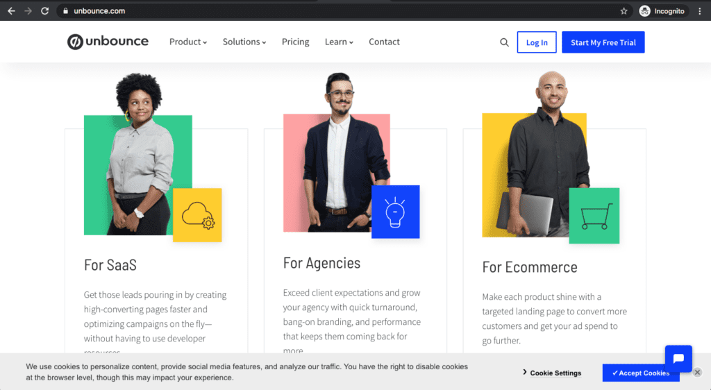
Consider the main thing you want people to do, and give it extra focus in the nav – it could be a button in a secondary color to stand out, for example. Do you want them to sign up for your email marketing? Or contact you for a quote? Or create an account? Whatever it is, put this CTA in the top right of your fixed nav bar, so it’s accessible no matter what page they’re on.
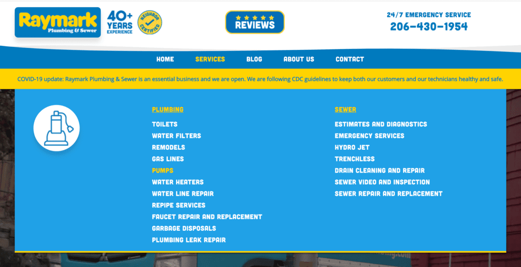
On Mega Menus
The “Mega Menu” is a type of navigation where each item brings up a full-width screen of options when you hover over it. This allows sites with lots of important categories to include everything without making the user click over and over again to see it all.
Example Mega Menu:
Embrace “Mobile First” Design
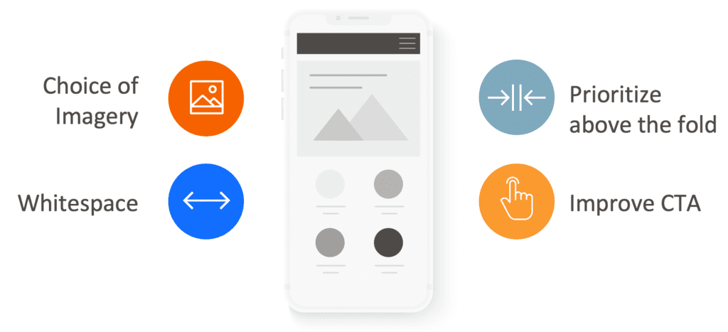
You may have heard the term “mobile-first” in the context of web design. Because over 50% of web traffic comes from mobile phones and tablets (Statista) these days compared with desktop/laptop computers, the screen size is more limited and you have to prepare for not everyone to see the site the way you initially envisioned it. It’s a good philosophy to keep at the start of creating content for your site, because it helps keep reasonable constraints on what you produce, especially for the pages higher up in the funnel that might first be seen on mobile devices.
Most developers and even DIY site builders have “responsive” web design baked into their product. This makes the elements of the site shrink and stretch to fit the screen they’re displayed on, and rearranges them at certain “breakpoints” when switching from one type of device to another, like desktop sizes to tablet sizes. However, responsive websites aren’t enough, because they don’t account for the user’s experience reading what looks like walls of text on a phone, compared to that same text with lots of negative space on a good sized monitor at home. To be truly mobile-first, consider the layout on a phone, and then what can be done with it to be more creative or interesting when it gets shown on bigger screens.
9. Make Content Your Priority
No matter whether you’re making a site yourself, hiring a freelancer, or outsourcing to an agency, someone from your team will have to help with website content for the redesign. The copy (words), images, videos used in web design, and other assets that populate your site are vital to the overall experience and effectiveness of the site. All of them either need to be provided by your team, commissioned to be created, or at the very least planned, reviewed, and approved on your end.
The biggest cause of delays for website redesign projects is not having content ready when the web designers and developers need it, in a third of cases.
Content Before Design
While you might have the perfect website template in mind that your whole team likes the look of, it’s wrong to approach web redesign this way. Think about it like this—the content is water, and the design is the cup. If you pick a cup of the wrong size for your content, you’re either going to have a glass-half-empty look, or a big wet mess.
Content Gaps
Another reason to start planning and gathering content early in the project is the “content gap.” Let’s say you have a great strategy that caters to your main persona, which has them show up on the home page, explore services, then validate with case studies, and finally request a quote. Only then you realize you have no good case studies in your library for this persona’s industry, which means you need to source and create that content. If you realize this at the end of development, your launch gets severely delayed.
Gathering Content
A good website redesign project plan uses a Content Gathering document to grab all the copy for all pages that are set to be on the website. It should be written by one dedicated writer to make sure the brand tone and voice are consistent, and it should be sharable amongst your team so stakeholders can weigh in where needed and make the job easy. And it should be formatted to be easy to understand by your web designer, and easy to copy and paste over for your web developer.
Not sure where to start?
Downalod our Content Gathering template here!

Not sure where to start?
Downalod our Content Gathering template here!
10. Wireframing for User Experience (UX)
Let’s review—you have a great conversion strategy, a sitemap to support it, an idea of what your navigation will look like, and your content is being developed concurrently. Finally, it’s time to start the visual design part of your website redesign.
Just like how we want content before the container, we want the skeleton of your pages before fleshing them out. In web design, that skeleton is called the “wireframe.” The basic idea is a simplified collection of shapes, boxes, lines, and copy that form how each page is going to be laid out, prior to any decisions about what pictures or videos go where, or colors, or font, or any other high level design consideration.
We break this out because it helps us focus on the user experience (UX) before getting distracted by the specifics of design. Instead, you plot out the path each persona takes. Consider questions like these:
What happens when you click this button? If persona X is at this stage, what information are they most likely to want next? How can we put that in front of them?
Wireframing & Prototyping Tools
Pen & Paper: Nothing wrong with sketching out some low-fidelity wireframe prototypes. You could cut each one out and position them on a wall or table to help show your team the flow from point to point.
InVision: The premiere web design tool helps you preview, test, and validate the user experience by turning your high-fidelity wireframes into functioning prototypes—interact with them to get a feel for the navigation, and leave comments for others on the team as you work to improve them. It requires a desktop design tool like Sketch to create the actual wireframes.
Adobe XD: This tool is both a wireframe creator and a prototype builder. Best of all, it’s available for free (with some limits on fonts and other high-end features).
Redesign vs. Rebranding
As you start transitioning from the skeleton of your website to the actual visual look and feel, it’s important to consider your brand. Does the logo, typeface, and color of your brand match the aesthetic you’re working on in redesign? It may well need an update, but think on it carefully—rebrands are much bigger propositions and will impact all your sales material, print collateral such as business cards, and anything else you use the brand on. It may also create market confusion with your customers and prospects if you don’t let them know clearly enough that the redesigned brand is you. Either way, make sure the branding and logo are in line with the new design you’re planning for the website.
Not sure if you want to rebrand as part of your website redesign project plan?
Download our logo redesign questionnaire and see if it’s the right move!

Not sure if you want to rebrand as part of your website redesign project plan?
Download our logo redesign questionnaire and see if it’s the right move!
Web Design 101
It’s been a long journey, but you’re finally at the stage most people envision when they start talking about website redesign—the design itself. If you’re going to work with a web design agency or freelancer, you should collect at least 5 websites you and your team really like the look of, as models to help communicate the design aesthetic you’re aiming for.
As you’re looking, here are some core elements you need to consider:
And that’s just to start! Check out our article on visual web design to get a more nuanced and complete approach.
11. Investing in Visuals Makes a Difference
All of the elements in the previous section add up to how “good” a website looks or feels. However, the quality of the images and videos being used is one area you absolutely can’t skimp the budget on. This will drag down the entire impression of the site, no matter how good the colors and fonts are. When you go to Apple.com, what is the website really? A bunch of blocks of solid color and very plain, very simple, very sparse text. The beautiful product shots and videos, taken specifically to fit into those spaces, are what makes the site look “good,” and build an emotional connection.
Stock Photography
Unless you have an in-house creative studio, you’ll probably be relying on at least some amount of stock photos and videos in your website redesign project plan. Nearly all websites use stock images to round out some of their visual content. There are inexpensive options, but they are often the most cheesy, alienating photos that really aren’t good enough. And cheap stock libraries tend to be limited—if you need a technical photo in your industry, you may not find one.
Custom Photography
Hiring a photographer and videographer is a must if you are selling physical products. Anything relating to the sale needs to be well-represented—there’s a reason McDonalds looks so appetizing in the commercial despite what everyone knows about the real product. The same goes for any shots of your facilities, and your team. Freelance photographers are everywhere at a variety of rates, but if you can find one who works specifically with web designers and understands the format and needs well, you’ll get the best results.
The visuals you use make a world of difference to connecting with your audience and keeping them engaged (or interested) through the buying journey—see the impact they make here.
12. Search Engine Optimization (SEO)
SEO is a technical and creative practice which helps your website attract organic traffic from Google and other search engines when people search for terms relevant to your business. SEO cannot be done well without the help of a specialist, so make sure this is part of your website redesign project plan, and that any team you hire has one on hand.
SEO Elements to Plan For
SEO Tools
Moz: Moz is one of the oldest and best SEO tools around. It helps you perform keyword analysis, audit your sites for issues, track how well you’re ranking for certain keywords over time, and even manage your business listings.
SEMrush: SEMrush has all the features of Moz, and is always expanding with more. It’s a tool most good web design agencies have.
Ahrefs: One of the most popular SEO tools around, this one has functions similar to what Moz and SEMrush have.
Screaming Frog: This tool helps you crawl all the pages of your site and get an overview of every element, page, and file you need to work with. It’s great for figuring out your URL structure and whether you need to do 301 redirects. Plus it’s free up to 500 pages.
Google Keyword Planner: This tool is technically built for Google Ads, but it lets you see the relative traffic of different keywords, and related keywords you might want to target so you can plan a list. While it does have more broad and general data, like the range of search volume on a keyword for example, it’s also free, making it a useful tool when choosing your keywords.
13. User & Usability Testing
Once you have your core pages ready, it’s important to validate your strategy with some amount of testing. At the wireframe stage, if you have a functioning prototype, you should do usability testing, where you give users a task and see if they’re able to navigate the site and complete the task. This helps you catch mistaken assumptions and smooth out issues prior to investing in fully designed mockups.
After pages are designed, you can do both usability testing and general user testing to get validation of design choices, understand how people feel about certain messaging, and more. This can be achieved with tools like UserTesting, and Google Optimize which allows for simple A/B testing.
Both of the above will use qualitative testing, which is like a focus group where a small targeted set of testers provide detailed feedback and rationale for their opinions and actions in the test. There is also quantitative testing which requires thousands of participants to remove selection bias—these can get expensive, but even mid-sized businesses can afford them using tools like SurveyMonkey and Google Forms. These tests are best for asking general yes/no questions and assessing affinity for certain messages or imagery with rating scales.
For an example of how user and usability testing can be put to great use, check out our case study on Erickson Aviation here.
Launch Your Redesigned Website
At this stage, developers have created all the pages and it’s time to get ready to launch. Use our checklist to make sure you’re ready:
If you have all of that ready and the go-ahead from developers, then congrats, your website is live!
Post-Launch Maintenance and Optimization
Launch isn’t the end. It’s the beginning.
For the first month, monitor your site obsessively. Check analytics daily. Monitor uptime. Check for error messages. Make sure everything’s working.
Fix bugs quickly. Users report issues? Fix them within 48 hours. Every day a bug exists is potential lost revenue.
Optimize for performance. Check your page speed. Optimize images more. Minimize JavaScript. Set up caching. Every second slower than your competitor costs you conversions.
Gather user feedback. Add a simple feedback form to your site. Ask in emails. Monitor comments. What are users struggling with? What do they love? Use this feedback to prioritize improvements.
Run A/B tests. Test different headlines, different button colors, different page layouts. Change one thing at a time. Measure results. Keep what works.
Use heatmap tools like Hotjar to see where people click, scroll, and get stuck. This shows you exactly where your UX needs improvement.
Create a maintenance schedule. Weekly: check uptime and error rates. Monthly: run backups, check analytics, run security updates. Quarterly: deep dive into analytics and plan improvements. Annually: evaluate performance against your original goals.
Update content regularly. A site with fresh content ranks better. Add blog posts. Update case studies. Keep your information current. Don’t launch and forget.
Plan ongoing optimization. Your redesign isn’t perfect on day one. Most sites improve significantly in the 3-6 months after launch as you gather data and fix issues.
Review your original goals after 3 months. Did you increase traffic by 30%? Generate 20 qualified leads per month? Increase conversion rate? If not, you need to figure out why and make changes.
Premium Hosting: Pick a premium hosting service that’s tailored for your content management system. For example, use WP Engine for WordPress. This gets you top-notch security and performance (cheap hosting is generally slower), plus world class 24/7 support.
Cheap hosting has terrible support—for example, on GoDaddy your site might be down half a week before someone might address your issue. All these services are essential for business continuity.
Don’t go cheap, since you need to protect your site from hackers, keep it performing with fast and reliable hosting, and have easily restored backups daily so you can roll back quickly if you mess something up or get hacked. You get what you pay for, and since your website is a major marketing arm of your business, it deserves quality.
Software Updates: At least once a month, backup your website and update your software and any plugins you’re using. Testing should be done in a staging environment, which is a copy of the live site, so you don’t interrupt business functions. Once everything is tested for compatibility with your theme, push the updates to the live website.
DIY vs. Working with an Agency
We’ve mentioned a few times throughout the article that you’re likely to be working with a web design agency. However, it isn’t always right for every business and every website. Use this simple guide to decide:
Do It Yourself
Redesign a website yourself with help from our guide when you’re creating a small, simple, and low budget website. This should be 10 pages or less, and the most complex feature on the site should be a built-in form. DIY is also appropriate when you already have all the visual content and copy you need. If you’re okay with using a cookie cutter template, this is the best bet for your business.
Hiring an Agency
In basically all other scenarios, it’s best to hire a web design agency. If your website has a lot of content, needs a unique design, requires custom solutions, uses a complex backend system, and if your valuable time must be spent elsewhere on the business, this is the right choice. Which begs the question:
14. How to Pick a Web Design Agency for Your Redesign
No matter where you are, there are plenty of web design agencies in your area, and of course you can really hire them from anywhere since the work is all virtual. That being the case, you need to carefully assess your options based on the following criteria:
Once you’ve made a short list of 5 or fewer agencies, create a request for proposal (RFP) and send it off! Check out our Website RFP Template to get started, and best of luck!


