Learn How to Keep Organic Traffic During a Website Redesign
Does Redesigning Your Website Hurt SEO?
It’s a common question, and the answer is—it depends! Every redesign forces search engines like Google to have to reindex the site, which will cause a temporary dip in organic traffic. Basically, the flows and links that were established are momentarily interrupted, but if all is done correctly, it should straighten out in 1-3 months after launch. It should even improve! But the devil is in the details.
When Website Redesigns Tank Organic Traffic
If you don’t consider search engine optimization (SEO) during the website redesign process, then you could face disaster like losing over 90% of your audience. Unfortunately many businesses do lose SEO rankings by setting up redesigns that:
- Are overly focused on distracting or confusing aesthetics
- Don’t take the user experience into consideration
- Reorganize the site in a way that breaks the essential flow
- Remove content that was drawing significant organic traffic
- Fail to redirect links to pages that no longer exist in the redesign
In this guide we’ll cover:
- The Essential Website Redesign SEO Checklist
- Planning Stage: Keep Your Redesigned Website Organized to Preserve SEO
- Design Stage: Don’t Ruin the User Experience, But Still be Ambitious
- Post-Launch: Test Everything and Measure Against Benchmarks
- Focusing on SEO Gains Will Help You Avoid SEO Losses
- Sayenko Design Approach to Website Redesign SEO
- Other Questions People Ask About Website Redesign SEO
The Essential Website Redesign SEO Checklist
Download The Essential Website Redesign SEO Checklist
The potential risks don’t mean you should stick with an old, flawed website. Done well, website redesigns are highly impactful, bring clarity to your brand story, guide your customers, increase conversions, and validate your value proposition. Let’s make sure you get the most from your website redesign without losing SEO by using this checklist. After we ensure that you avoid a drop in search engine rankings we’ll talk about how to improve your SEO rankings, as a website redesign is the most cost-effective time for it. Let’s dig in!

The Essential Website Redesign SEO Checklist
The potential risks don’t mean you should stick with an old, flawed website. Done well, website redesigns are ambitious, modernize your brand, increase conversions, help your customers, and simplify your business operations. Let’s make sure you get the most from your website redesign without losing SEO by using this checklist.
After we ensure that you avoid a drop in search engine rankings we’ll talk about how to improve your SEO rankings, as a website redesign is the most cost-effective time for it. Let’s dig in!
Planning Stage: Keep Your Redesigned Website Organized to Preserve SEO
How to Plan Your Website Redesign for Better SEO
There are four areas that affect your website’s ability to get organic traffic.
Website performance
Your technical performance is essentially the table stakes of SEO. Does everything work together the right way? Do links work? Are the correct tags in place? Does the site load quickly and correctly, no matter which web browser and what kind of device is viewing it? This is a good place to start—having a technically competent site will not make your site rank well on its own, but having an error-ridden site will guarantee it won’t rank well.
Planning a website redesign for website performance means picking a platform that can load content quickly, choosing hosting that is secure and high quality, and making sure there are no errors on the website.
Onsite content
The content of your website is what Google search bots crawl and index, helping them understand what your website is about and who it’s for. This has to do with the words on the page, the images on the page, the keywords present, but also the way the whole site comes together—do you have a library of content that suggests you’re an authority on the topic you’re writing about? Have you given yourself a space on the site to easily publish lots and lots of new content, like a blog section? It’s a great place for a resource center which includes posts like thought leadership, industry insights, how to articles, templates, white papers, and educational content around your core offering. Website content also applies to the “metadata,” which is information users don’t generally get to see, but tells search bots about pages, images, etc. These are things like title tags, meta descriptions, and alt text.
Planning a website redesign for onsite content means optimizing the content you do have, and making sure it all survives migration and is presented in a way that both visitors and search bots can understand. You would also need to verify the originality of your content by conducting a plagiarism check to avoid using duplicate text on your website.
User behavior
What users do on the site informs a lot of how a site should be planned. If they spend a lot of time on a page, reading content, watching videos, and then click through multiple pages in a single session, that’s positive user behavior that search bots interpret to mean the content is of high quality, and should rank higher. On the other hand, they could bounce after just a couple seconds on the site, because it takes too long to load or it’s ugly or clearly not what they were looking for, that’s bad user experience that would be punished in the search rankings. It’s not just important for organic traffic—the users need to be able to navigate to and perform conversion actions, like filling in forms, buying products, and sharing content.
Planning a website redesign for user behavior means understanding what you want them to do, and making it easy for them to do it. It also means making the site appealing in any way possible for your target audience.
Backlinks
The biggest signal that Google receives about your site to help decide if it ranks or not is one that you have the least control over—how many websites link back to your site, and how high quality are the sites that do. Getting backlinks from high quality sources that are relevant to your website’s topic tells Google that your website is also reputable and likely to be relevant to people searching related topics.
Planning a website redesign for backlinks means preserving the ones that are high quality, and disavowing the ones that are of a low quality so that you don’t get penalized for potential spam, and keep all the good reputation you’ve already earned.
Following the above advice will get you in the right direction, but only you tailor your website to your specific needs and situation. That’s why you must understand what you want from your website and how it is performing right now.
Audit Your Website’s Performance and Your Business Objectives
Start by figuring out your baseline metrics and establish your benchmarks, including:
Keyword rankings
Ranking well for keywords is essentially the whole point of SEO, but if you’re here worried about a redesign potentially tanking your SEO, you already know that. Make sure you have all your desired keywords chosen, and take the current position in Google searches for all of them. You can use the basic SEMrush reports to track position for free, as a starting point.
Click-through rates
How often do people who look at a link also click on it? Click-through rates (CTR) show how well your page performs in terms of (a) getting the attention of people who see it in search results, and (b) getting them to click on it. Learn how to calculate your CTR for SEO.
Page speed
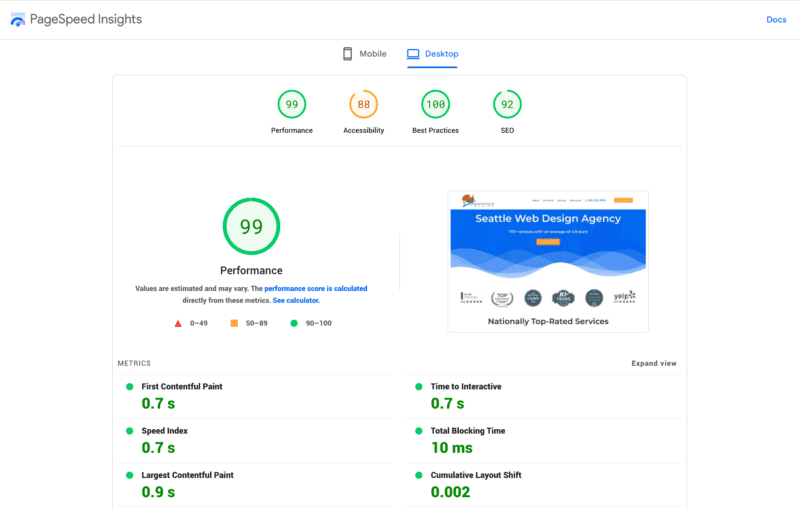
How fast do your pages load? Page speed is an essential metric because searchers are impatient. People really only read something to solve a problem or gather information, and they love to skim. Don’t lose traffic to a page with great content because you didn’t check to see if it loads fast enough: A good rule of thumb is between 0 to 4 seconds. Google PageSpeed Insights is a great tool for auditing this.
Bounce rates AKA Engaged sessions
Do people leave your website after looking at one page? A high bounce rate in general is 70% or higher, and means the page in hand provides a poor user experience, perhaps because the content itself is not informative. After pulling a page together in a way that satisfies you, check the bounce rate over time to confirm that you were correct.
Also important to note: while bounce rates are a metric marketers traditionally paid attention to, this is starting to go away with the introduction of Google Analytics 4. This update now gauges the “Engaged sessions” you have instead of bounce rates—higher is better, and you can choose how long a visitor has to stay before it gets logged as engaged.
Time on site
How long do people spend on your website? Time on site is a good measure for understanding the value of your website holistically to visitors. The more time they spend on various pages, the more value your overall digital presence has to them.
Conversion rates
How often do people who took one action (e.g., click a link) take another that you intended (e.g., buy a product)? This is one of the more important metrics to focus on. Conversion rate optimization means understanding your audience well enough to increase the percentage–hopefully between 1 and 4%–who take actions that you want them to take. Eventually this means doing business with you.
Take your time with the website metric audit. The more accurate and complete your data is at the start, the better you can understand how well your site is performing post-launch.
Redesign SEO Planning Checklist:
After your website metric audit, you now understand performance well enough to make some decisions about what pages to keep, which to significantly improve, and which to remove. Check through these major factors.
Review each page’s content
Run an audit through SEO tools like SEMrush or Yoast, or have your agency do it for you. See what keywords each page ranks for currently if any, and what they’re currently optimized for. Is there enough content on the page? Is the target keyword and synonyms repeated enough, in key places? And if so, does the page still read well? Also check technical things like load times on page and non-optimized visual content. Load speed is a major factor in SEO.
Check the user experience
Another big SEO factor is the length of user sessions and “engaged sessions,” which are measured by things like time on page, and how many pages they visit during one session. Good user experience (UX) would include things like obvious buttons and navigation, and directions telling users where to go. The easier their journey is, the more pages and time their sessions will have.
Create site architecture
Sketch out the site architecture (the organization of your website from top to bottom) you want for the redesigned site. Create wireframes, simplified outlines of all your pages, to trace the journey that visitors will take from the page they enter to the page they convert on. You can do this on paper or a whiteboard, but it’s most effective to work with digital tools like Figma or Sketch for easy iterating and working with the redesign team and your web design agency.
Put an XML sitemap in place
Have an XML sitemap in place. To put it roughly, it’s like site architecture that a search engine algorithm can read. Have your developer put one together and send it to major search engines like Google and Bing. If you’re using WordPress to develop your site, most sites install the Yoast SEO plugin that generates a sitemap living on your site like this: example.com/sitemap.xml. Another good resource for mapping out your site visually is Octopus.do.
Minimize URL disruption
Plan to change as few URLs as possible to minimize the amount of work you’ll have to do later on. For the URLs you do change, have 301 redirects (linking old URLs for the same location to new URLs) planned in advance. This ensures that you won’t send visitors to nowhere and cause search engines to drop your website in the organic results.
Leave high-performing pages be
This is the final and very, very important point before you move on to the design stage. Use the metrics we just discussed to identify your best performing pages–and then leave them alone as much as possible in your website redesign. You can tweak things to make sure they match your overall new design, but overall if you like the organic traffic a page is getting, its content, URL and links should be left to keep on winning.
Migrate or create a blog to store SEO content
It doesn’t matter what you call it—news, resources, help articles—you need what is functionally a blog on your site if you intend to do well in SEO. The more content the better (provided it’s unique and of high quality). And on your core pages, like the homepage, about page, services/products, industries served, or whatever they may be, there’s only so much room. Cramming content on core pages can help with keyword optimization, but will be so unusable for readers that they don’t stay on the site long or share content—a net negative for SEO.
Design Stage: Don’t Ruin the User Experience, But Still be Ambitious
Put your users needs before your wants. The site is built for them, not you!
Ambitious website redesign is a good thing. Done well, the project will be a big boost to your business and brand. But in the course of design, it’s tempting to take a design-first approach, when it’s more important to go strategy-first, with goals and content in mind. That’s how you avoid choices that make organic traffic take a hit.
Develop on Desktop But Design with Mobile in Mind
Mobile traffic started outpacing desktop traffic for the average sites around 2017, and it’s only increasing. While some B2B sites will still have over 50% of traffic coming from desktop due to the buyers often being in offices during work hours, the portion of mobile traffic will still be so significant that it cannot be ignored during the design phase.
This creates a disconnect with the website redesign process, which is usually done by office workers working on big desktop displays. A lot of the most interesting or unique designs can only actually be appreciated with all that screen real estate. But half or more of your visitors won’t see it.
Emphasize the mobile experience during design, paying special attention to the load speed on phones, what elements can actually be used and scale properly on smaller vertical screens, and how much reading anyone actually wants to do in that context. Do giant animations, flashy videos, hover effects, and long paragraphs actually help out the user experience? Make sure you or your web design partner emphasizes “responsive design” which allows your website to adjust to any screen size, from a 32” ultrawide monitor to the smallest iPhone.
Put Important Content Above the Fold
When redesigning a site and planning migration of content, it’s tempting to bring over everything, and put your best content right at the top. But you need to plan around visitors not staying on a given page very long, or scrolling to see all the cool stuff you put throughout the site. The stuff at the top of the screen before scrolling is what’s “Above the Fold” and it needs to tell enough of the story and provide the next step right away.
Cut the Clutter and Prioritize Minimalism
This isn’t to say all sites need to look the same—but for reasons like ease of use on mobile, load times in general, and a pleasant user experience, less is almost always more. That means don’t wax poetic after important information is imparted. That means don’t have every element on the page get a unique animation. That means save pop ups for a handful of important conversion events in key areas. That means use a little negative space so there’s room to breathe—this is especially important on small screens.
Check Page Speed After Putting a New Element in
Before adding too many elements like frequent animation or videos, test how they affect page speed. It’s a critical measure as people are impatient and won’t hesitate to move on to a competing organic result. Keep page loading times between 0 and 4 seconds to compete effectively in SEO.
Follow the Best Practices on Web Design
There are artistic and daring sites which break the mold, push the boundaries of what’s possible in web technology, and even win awwwards. There’s just the small problem of them not converting a lot, and not keeping the average person on the page long enough for good SEO. Don’t reinvent the wheel when it comes to well studied best practices on these elements:
Top level navigation
List out a handful of important main categories, and beneath each break them out with either regular menus or mega menus containing subcategories. This top level navigation needs to be sticky at the top, though it might disappear when scrolling down and reappear when scrolling up. On mobile devices, the navigation should be a small hamburger menu which can expand and be tapped on to reach important pages and subpages. And most importantly, there should be button in an obvious, separate color, that directs users to a single most important action to take that’s important for your website to convert. Whether it’s a contact page, a sign up, a purchase, a donation, there should only be one highlighted.
Global footer
At the bottom of your site, on every page, there should be a consistent footer. An optimized footer will have essentially a sitemap of links and important information, plus the same global CTA from the header. The links are helpful for users who may be frustrated and scrolling rapidly. They can find other paths to take at any time, anywhere on the site, which keeps them on the site longer—always good for SEO. This is also great for search crawlers—they can use your footer links to get to deeper pages on the site, which makes indexing easier and improves your SEO too.
Calls to action (CTAs)
Aside from the main CTAs in the navigation and footer, you should always indicate CTAs with similar colored buttons, anywhere they matter on the site. Often these can be found in the hero section near the top of a page, or next to important info like pricing. Make it clear, directive, and only a few words per button, like “Buy Now,” “Learn More,” or “Join for Free.”
Site search
A feature of most modern sites is an internal search, which allows users to find content by keyword throughout the site. This helps them navigate the site and find what they need when your menus aren’t doing the trick. This also helps SEO bots figure out keywords that are important to your users.
Page titles
Not to be confused with metadata, this is the literal title of pages, both on the pages themselves through H1 tagged headlines, and within menus in the navigation. Some websites try to be cute with uniquely-named pages. For example, instead of “About Us” they might say “Meet the Squad”, or instead of “Pricing” they might say “So What’s This Gonna Cost?”. Make your choice on the over-under for uniqueness and brand identity vs. ease-of-use and understandability to search engines. But when SEO is the goal, opt for the latter.
Post-Launch: Test Everything and Measure Against Benchmarks
Get multiple pairs of eyes on your new website
Congratulations on your new website launch! After you pop the champagne follow the checklist below, because a bit of discipline will keep you from losing traffic in the event something was missed along the way.
Test Everything
Get multiple pairs of eyes on your new website. Ask people on your team to go through the conversions you want your visitors to go through. For example, if there’s a new and important page aimed to rank in SEO with a CTA to your services, have people walk through that series of steps.
Double check these 4 things
4 issues tend to get overlooked after a website launch so double check them:
Unblock your website for search engines
A developer will create a live website for redesign and block search engines from crawling it with a noindex tag. This way you can design your new website with privacy. Post-launch, you want your content to rank in organic results, so the blocking will need to end. Confirm that robots.txt is working as you want. Robots.txt is a file that tells Google or Bing what URLs on your website they can crawl.
Confirm correct Javascript implementation
Javascript is a coding language used by basically every website, it will likely be on yours too. It can be difficult for search engines to understand and if they don’t in your case, your pages won’t rank well in organic results. Have your developer double check all Javascript.
Ensure the live site matches the testing site
Confirm that everything from the testing website made it into the live website. This applies to elements within a page–like tailored meta descriptions–and whole pages themselves. Much happens during a website redesign. It is easy for something to be lost in the shuffle.
Run performance tests
The development website will have been performing quite well (e.g., fast page speed). But at times the launched website will perform differently. It’s important to run tests with real users, and also in tools like Screaming Frog and SEMrush which check for technical SEO issues.
Use Metrics To Compare Baseline To Benchmarks
A small dip in traffic is to be expected no matter how good you handle your website design requirements for SEO. Your website traffic and other performance metrics should be back to normal (or better) within 3 months. If all was set up correctly, you can expect improved performance after that. Monitor your metrics in Google Analytics based on your business goals, as you learned to do in the planning stage audit, over time.
How To Handle Abnormal Dips In Traffic
If you notice a sustained dip in traffic, determine which pages are problematic. Is the path to them blocked a bad redirect? Is it navigation? Are the visuals distracting? Does the page load slowly? Audit the page for technical errors like improper tagging, missing metadata. You could also look into backlinks, maybe they were affected by the launch. In that event you may need to do outreach to authoritative websites in your niche, asking for backlinks which can help build your authority with search engines as well. Or perhaps too much content was removed when it was ranking well. In this case, simply add the content back into the appropriate pages in a way that meshes with the new design.
Focusing on SEO Gains Will Help You Avoid SEO Losses
Business websites are often treated as dumps for everything a business has done.
If you’re committed to a website redesign, then you’re going into a cost effective time to improve SEO overall. The best defense is a good offense, so if you’re worried about losing organic traffic in a redesign, commit resources to improving SEO all the time.
Prune unnecessary pages
Business websites are often treated as dumps for everything a business has done. You should eliminate content that simply is not worth updating, such as pages that have been around for a while but have zero backlinks and low or unvaluable traffic that isn’t likely to convert. Rewrite any duplicate content you have kicking around, as search engines penalize it. Update content that stands a chance to rank, like pages currently in the top 50 results for important keywords.
Choose a good developer platform
Use a platform that automatically optimizes for large images. WordPress is one of the best options out there, which is not only pretty user friendly for lay people, but as the most popular development platform it also has a great network of support from freelancers and agencies.
The design options available in WordPress are nearly endless, and with plugins you can add any technical feature you need—including easy SEO optimization through Yoast.
Focus on ongoing SEO best practices
Make sure these best practices are in place among non-developers in your organization. Important things like title tags, meta descriptions, and alt text are much easier to manage if you add them each time you create or update a page or blog post. Have a standard practice for naming files and metadata for consistency across the site, too.
Cost Calculator
With this article’s checklist in hand, you can now be sure that with the right developer you won’t lose SEO rankings due to your website redesign. But there are many facets to a website redesign, especially a high quality one. So how much does a website redesign cost? Calculate market rates based on service provided with Sayenko Design’s website redesign cost calculator.
Sayenko Design Approach to Website Redesign SEO
Over 80 years of combined experience
Sayenko Design is a website design firm with over 80 years of combined experience and dozens of website redesigns under its belt. A sample of over 50 client reviews on Clutch.co gives Sayenko 5 out of 5 stars. We love redesigning outdated websites into new beautiful and functional ones for high-performing businesses and nonprofits. We want to highlight 4 pieces to our redesign: digital strategy, web design, custom WordPress development, and SEO.
Digital Strategy for Website Redesigns
We approach every website redesign with strategy in mind first, tailored to your business operations. What are your acquisition channels, and what are your conversion points? How can we rebuild your website to optimize for these goals and automate the things you need to do repetitively to make your business work? With this approach in mind, we create websites that focus on conversion in addition to looking good.
Web Design and Redesign
After strategy, we approach web design from a content-first perspective, then build beautiful designs around that content. This is logical—you need the foundation and frame of a house before you build walls and slap paint on it. Design-first approaches may be visually interesting, but often end up leaving no space for important content, design sections that aren’t actually used, and not take the user journey nor conversions into account.
Custom WordPress Development for Redesigns
Sayenko Design focuses exclusively on WordPress to develop websites for its clients—including migration from other platforms to WordPress. WordPress powers half the world’s websites. This is no accident, it is the best platform for high-quality websites, offering a user-friendly UI and content management system (CMS) for the businesses that use them, even after their developer is gone. After Sayenko has done its work, you will be able to use plugins like Yoast to manage your SEO without depending on technical staff to do so.
Search Engine Optimization
Sayenko Design’s web designs bring SEO considerations in from the start. During the planning stage we prep redirects based on the sitemap, plan content migrations based on the strategy, and inspect technical issues and handle keyword research. We always take baseline metrics. That way, you know where you stand and can plan for the future after your beautiful redesigned site launches.
Sayenko Design is a Seattle-based website design boutique. We are happy to provide you with content like this and we could explore a website redesign of your own!

