Background
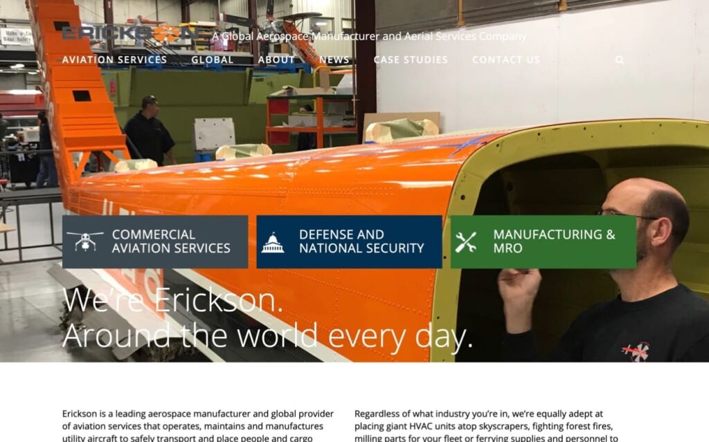
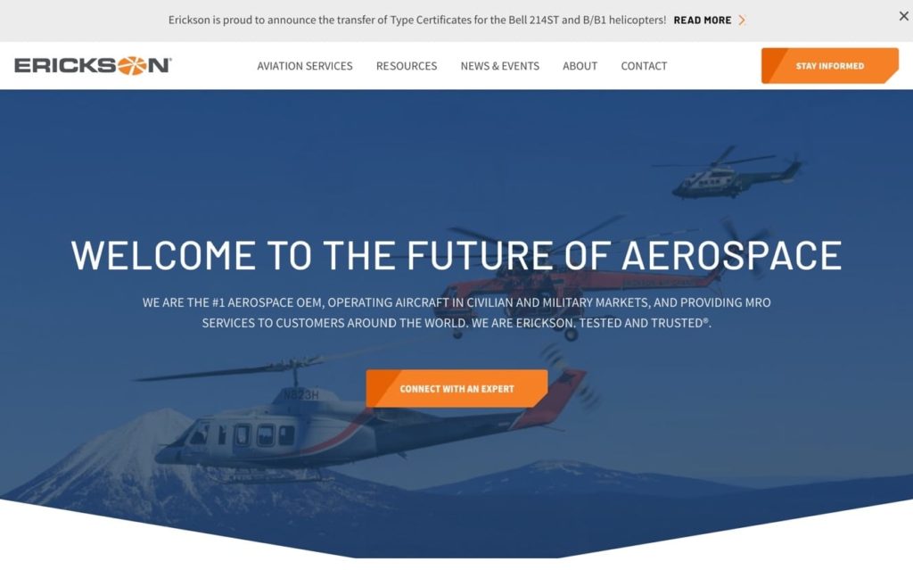
Erickson Inc. is a global provider of aviation services, specializing in defense and national security, manufacturing and repair, and commercial services like firefighting, powerline construction, timber harvesting, oil and gas. Erickson has a history of innovation and invention in the commercial aviation industry, but their outdated website and confusing organization wasn’t giving them the airlift they needed. And when you’re selling to companies and governments all over the world, you need a world class web experience to help finish the sale. Sayenko Design stepped in to help Erickson’s potential clients understand why they’re “Tested and Trusted.”
Project Includes
Website Goals
1. Generating sales-ready leads for the sales team
2. Educating prospects on services with helpful and engaging resources
3. Streamlining the lead funnel with modern UX best practices
4. Update the brand identity and keep it consistent across print and web
5. Introduce and define “AeroSystems” to the audience


Website Strategy
The foundation of project success centered on targeting seven distinct personas:
Extending the Brand throughout the Organization
One of the issues mid-sized companies like Erickson face is siloed efforts, like updating a website but leaving other brand expressions outdated. To help Erickson’s new image remain consistent throughout their long sales cycle, we delivered comprehensive brand guidelines, and provided a suite of sales materials such as brochures, PowerPoint templates, one-pagers, and email templates.

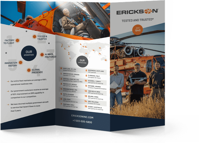
Retooling the Brand with Modern Mechanical Design
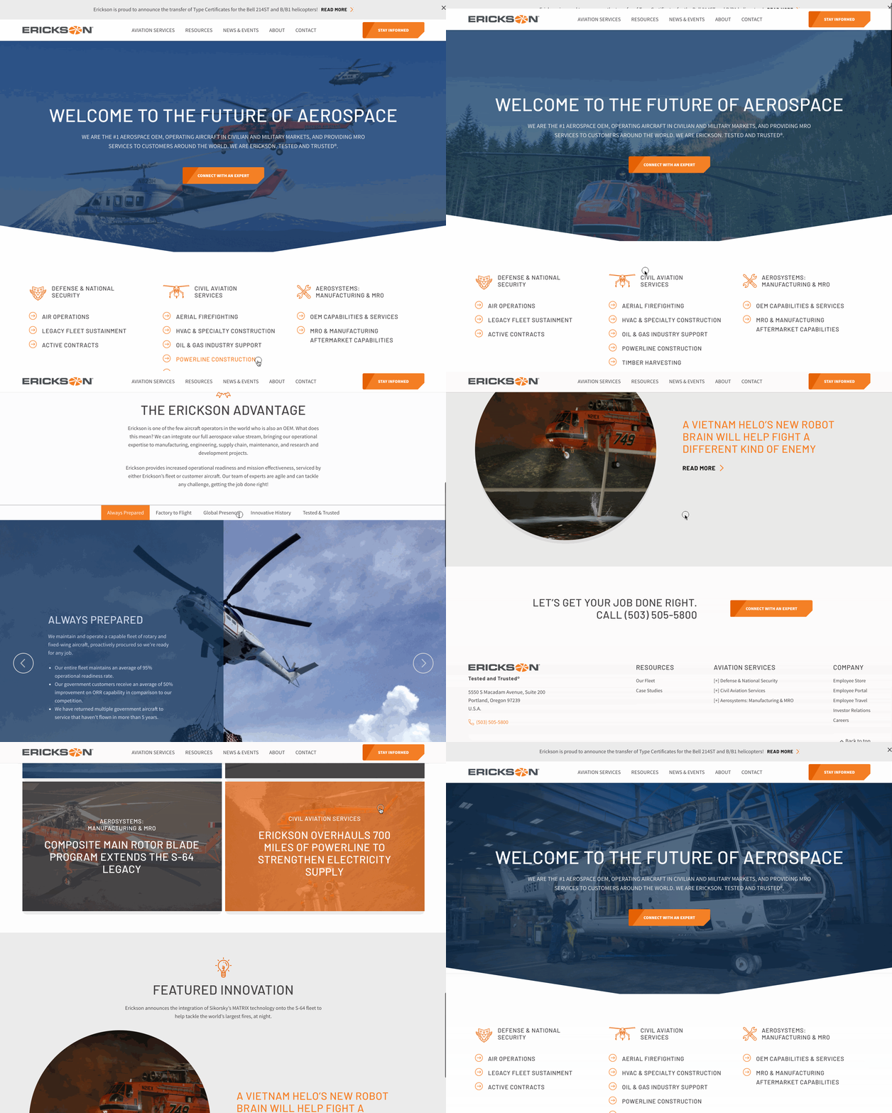
One of Erickson’s chief concerns is appealing to the aesthetic tastes of their hardware-centric customers and keeping the site up to date. They’re competing with the likes of Raytheon and Boeing, after all. We highlighted their attention-catching brand orange throughout an otherwise more balanced design to pay homage to their history, while adding diagonal corners and schematic-style icons throughout the site, giving it the edge they needed to catch their customers’ eyes.


Organizing a Vast Service Suite & Catalog
With seven unique personas, three major service areas, eleven sub services, and a fleet with seven different aircraft types, Erickson had a tough time keeping the site organized and easily navigable for non-internal visitors. We used the personas as a baseline and gathered the various parts of the website into as few sections as possible, and highlighted different sections with original iconography that kept users grounded. We then cross linked every part of the site so that their users, who have long sales cycles and do lots of independent research, could explore without friction—a service would lead to a relevant case study and pages for the various aircraft that made it possible, for example.
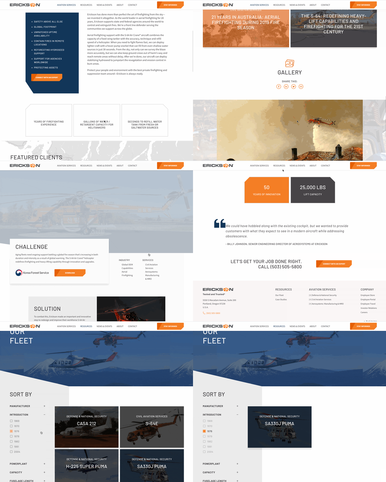
Writing Powerful Copy
Erickson had many different types of customers to speak to, and no real unified voice. We determined a brand voice that was experienced, confident and experimental to help demonstrate that they weren’t just tried and true, but also constantly innovating. We applied that copy to every page of the website, giving it a consistent tone to help convert customers.


Testing Usability & Design
With such a big website overhaul and so many moving parts, we knew we had to get objective third parties involved to make sure we were as “tested and trusted” as Erickson itself. We designed qualitative usability tests on the wireframes and then general feedback tests on the fully designed mockups, with a testing pool carefully narrowed down to industry professionals and possible Erickson customers. With their guidance, we were able to make a site that confidently guided users to conversion.

The Results
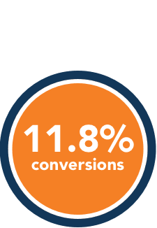
11.8%
Conversion Percentage
22.7%
Increase in Google Rankings
We helped the many personas find the information they’re looking for quickly and become MQLs for Erickson’s busy sales team, while improving the overall impression of the brand and company.

A Word from the Team

“Whenever we can use data to back up our decisions, the project really takes off—especially when it comes to organizing the navigation of such a complex site. It was incredible to learn how much impact a relatively small vendor makes in the world with governments and the military, and the Erickson team was a pleasure to work with.”
~ Nik Amar, Strategist

“Modern web design tends to emphasize some elements like simple lines and soft shapes and type that really don’t fit every brand. With Erickson, we needed to marry the often flat, bichromatic best practices with something more dynamic and edgy, which made for a unique challenge that I think we pulled off really well.”
~ Mike Sayenko, UI/ UX Designer

“Erickson’s website is the type that needs to focus on page-speed and dynamic animation, a tricky balance to pull off. With so many post types and custom architecture, they really gave my dev chops a thorough test. This one was a blast to work on.”
~ Kyle Rumble, WordPress Developer

